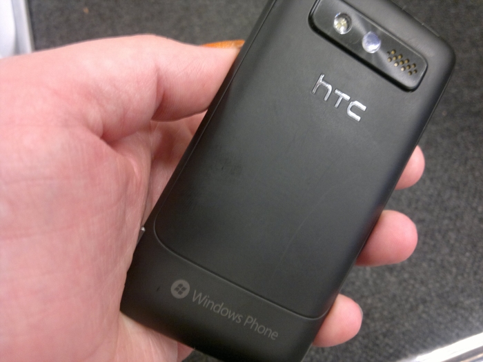
There are shades of the N8 in the Trophy. It's a slab only design, relying on the touchscreen for all input (bar a few buttons on the outside edges of the device). There's a bulge for the camera unit that feels rather familiar in my hand, and the finish on the plastic back case of the Trophy brings back memories of the Psion Series 3c.

The most noticeable part of Windows Phone though is the Metro UI. The two main elements are the application launcher, and the the navigation of the various list elements. Let's start with the launcher. With two views, which you can slide between with a swipe left or right with your finger, the idea is simple - on the right hand side of the sweep you have a single alphabetised list of all the installed applications, the left side is made up of larger tiles, the so called 'live tiles'. You can organise and order these to your heart's content, adding in new applications or removing them. This is essentially the home screen, with the other side being the installed applications view.
And that's the basis of Metro.
The paradigm carries over into all the built-in applications, and its use in third party applications is encouraged. The fact that the UI is consistent means that, even though it's a different feel, the learning curve is pretty shallow, and that's a good thing for new users.
So the UI is going to be the "brand new look" for Nokia, and given Windows Phone's comparatively small uptake in the market, it's going to be regarded by many as a new and modern UI. For me, it feels a step back from the Zune HD media players (of which I am a big fan), but that's probably because there is a wider range of possible use cases in a programmable portable computer than on something that plays MP3's. Does it take some getting used to? Definitely, and there are quirks (the most obvious being that if a word is longer than the screen is wide, it will not wrap around, but simply be cut off, leading to some rather wonderful puns appearing on screen if you can set it up correctly).
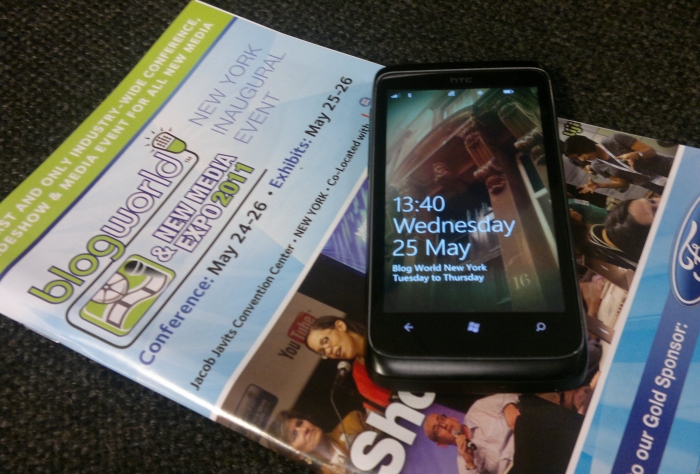
What was a disappointment for me was a time. 2pm. To be fair to the Trophy, I've decided to give it a test in the real world similar to the Nokia E7 that I took from Edinburgh to Austin, Texas, when I was going to SXSW. This week I'm at the first Blog World Expo to be held in New York. So I left the house (missing the volcanic ash) to get a connecting flight to London, and then on to America. You may recall the E7 made it all the way through the flight and into my Austin hotel, so I was hoping for a similar result from the Trophy.
Nope. It managed just five hours. It came off a full charge as I left the house, it started to be used "in anger" at around 9am for MP3 and social network interaction (Twitter and Facebook), in much the same profile as the E7. By 2pm, just as I was boarding the London-New York flight in Heathrow, it died on me with an empty battery.
Yes, I've a portable rechargeable battery, or you could swap out the battery by popping the cover off, but for a modern smartphone to not make it through the day is a bit of a problem. Windows Phone relies on connectivity to the cloud (it's part of the design brief to always consider the cloud when developing an application), so it knows it's going to be doing a lot of radio work.
Nokia's traditional and legendary long battery life image is going to make for an interesting contrast when their Windows Phone hardware arrives.

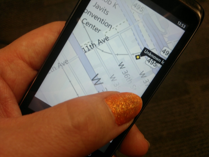
The reliance on the cloud presents other issues for the traveller, and that's mobile data. Much more than Symbian, Windows Phone expects to have an active data connection at its beck and call. The mapping application, for example, does not allow you to preload the data, it pulls it down the data connection as needed, including the database of places for route planning. It works, but after using Ovi Maps it feels very much like a "lite" version of mapping on a mobile. This is probably more a reflection on just how good Ovi Maps is, because Maps on Windows Phone does do the job, but be aware it does need an active connection, either Wi-fi or more likely when out and about, 3G data.
That means that you're going to need to use either roaming data (which is going to hurt your wallet), or pick up a Pay as you Go SIM. Luckily for me, I already have an AT&T SIM card from my SXSW travels, so pop into a supermarket, buy a top up card, and drop the 100MB of data for $15 onto the account and I'm good to go. Only to discover that there is no built-in data counter in Windows Phone - hopefully one of the five hundred changes in Mango will include a data counter. For now, AT&T do track this for me on the web, so I'm keeping half an eye there as well, and will let you know next week what my data usage has been like.
Right now, while checking emails, Twitter, Facebook and Foursquare in a fast moving conference environment, Windows Phone feels perversely hampered. It's not a slow operating system, there's no lag in the transitions or scrolling, the manipulation of thumbnails, images, artwork and text flipping, folding and sliding around the screen as you move between applications is seamless. But with so much data being downloaded from the internet there is a natural log-jam in getting data onto the screen.
Put yourself in a conference centre where the choice is to join a lot of people trying to connect on the slow wi-fi, or to attempt to get a 3G connection while in the really big, albeit leaky, Faraday cage that is the Jacob Javits Convention Centre; and Windows Phone suddenly requires a lot of patience. There's a lot to be said for Symbian running a bundle of social network apps in the background (and also having everything wrapped in Gravity).
The lack of multi-tasking is something that has been noted by many as an issue for Windows Phone. To be honest, it's as much of a style issue as one for people to hit Microsoft with. I suspect that running a number of status updates in parallel, switching between them, would take roughly the same amount of time as doing it in order. Symbian gives you the choice, but Windows Phone makes you always go down the serial route. It feels slow though, and that's probably the most important thing.
It's at this point people will point out that the early versions of iOS didn't have any kind of multi-tasking either, and it was added in at a later date. Similarly Windows Phone will get multi-tasking in the Mango update and it's this version that Nokia will use in its first phone.
Right now, while I'm still in the middle of the test, it wouldn't be fair to judge the outcome, but I can say this: I can do the things I want to do online with the Trophy. It might not be graceful, or optimised, but I'm not feeling limited. In fact there's confidence that Windows Phone will continue to do what I need it to do. That's a great feeling to have after a few days on the road, and one day of Conferencing.
Will it continue? I'll let you know...
-- Ewan Spence, May 2011.
