Colour and light
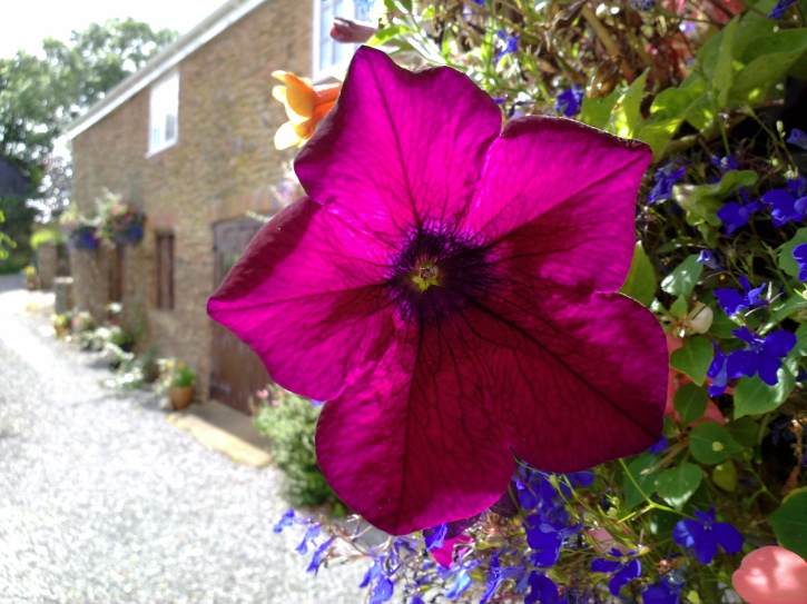
There was a spectacular purple flower on the balcony or our holiday flat and I wanted to capture it with the sun shining through the fabulous petals. Hopefully you'll agree that I caught it well, but there were several challenges that I had to overcome.
First of all, I had to be aware of the light and its direction - I wanted the sunlight shining through the petals, not on them. Which meant waiting for the right time of day. And it meant shooting into the sun, normally a no-no, whether you're on a cheap camera phone or an expensive standalone device, as it means 'flare', ugly shafts of light on the final image.
The solution was to hold the phone (in this case, the N86) in my right hand, snapping one-handed, while the other hand was held up and to the front of the phone so that the camera glass was in shadow - I had to be careful that the shadow didn't fall on the flower itself and I had to be careful not to get my hand in the shot, but it worked and there was no flare.
Finally, I took about six attempts to get the shot, as I fine tuned the shooting distance and focus, the positioning of the shadowing hand etc. This is an important point to get across though - finding that only one shot in 5 really works isn't a problem. In fact, it's an indication that your photography skills are getting better - because it means your standards have risen, i.e. you're no longer satisfied with an image which isn't as good as you can possibly get. Back in the days of 35mm cameras, I'd usually get 2 or 3 really great photos per roll of film - a ratio of 10 to 1 bad to good is quite normal when you're striving to be as good as you can be.
Exposure
"Daddy, you're all dark" was the prelude to a very common photo problem. In this case, my daughter was photographing me up on the wall at the top of Dunster Castle. Behind me was a seaside vista and bright overcast sky. And, not surprisingly, the auto-exposure algorithms in the phone's (in this case, the E7's) camera averaged light across the whole frame and thus my face (in this case, with my eyes closed, so the photo was rubbish anyway, but....) ended up far too dark. Not quite a silhouette, but well on the way.

Happily, I knew exactly what to do. Tapping on the 'more' icon in the Symbian Camera interface, I tapped on 'Exposure' and upped it by a full 'stop'. "Take it again", I instructed and my daughter obliged. Here's the result.

As with so many photography problems or tutorials then, it all came down to awareness of light. In this case, I wanted more light to be allowed in across the whole image/frame. There's always a compromise involved, of course (short of doing High Dynamic Range shots - a topic for another day), in this case my face is fine but the background becomes washed out. Still, people are the most obvious primary point of interest in a photo so it was best to optimise for nearby faces etc.
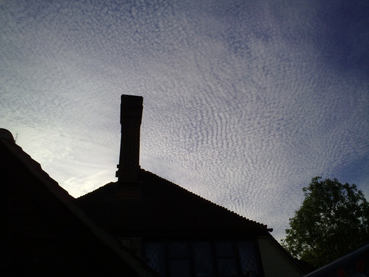
A reverse situation is shown below, the sky was filled with an unusual cloud pattern and I wanted to snap it from my vantage point in the pub beer garden(!). In this case, auto-exposure made the sky too light, with the phone trying to bring out some detail in the foreground building. By decreasing the 'Exposure' by a 'stop' or so, I was able to get proper exposure for the sky, which is the bit I wanted, leaving the pub as a dramatic silhouette:
Remember that the 'auto' algorithms in your Symbian smartphone's camera are an excellent best guess at the settings needed and will produce good results in 90% of cases. But it's worth noting how to tweak things to get great photos in the remaining 10% of cases, when light conditions are more 'interesting'.
Don't be afraid to crop
There will be many times when you're not optimally positioned to take a photo. Or perhaps you're not sure where the action's going to be. Either way, there's no shame in capturing a scene or moment at a slightly greater distance than originally planned and then cropping gently later. With today's 8 and 12 megapixel cameras, as long as the light's not appalling you'll have enough detail to play with and your final image will still have enough pixels to easily fill a computer monitor, TV screen or standard sized print.

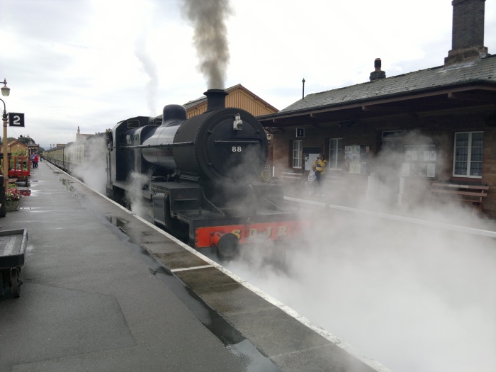
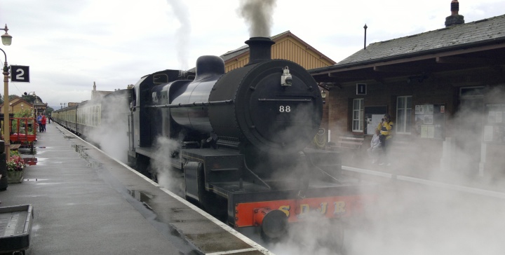
For example, above I was shooting a steam train starting off. The light was very non-descript and it was raining, but that didn't stop me trying. I captured the train and its steam pretty well, but it's all a little 'casual'. There's not much happening (i.e. not much drama) in the top and bottom of the frame. But I'd shot this on the N8 and had megapixels to spare (and then some). Using the 'Edit/Crop' tool in the N8's photos, I ended up with this framing, which looks more 2011/widescreen/dramatic:

__________
A handful of photos then and a few insights into what goes on inside my head when I try to get the most from smartphone cameras. Hopefully you've been inspired to do even better than me in the future?
Steve Litchfield, All About Symbian, 21st August 2011


