Defining a phone form factor
Phones are incredibly personal devices, and so any discussion of design will be divisive. To be as objective as possible, one needs to set parameters. Therefore, the basis of my argument is as follows:
To qualify as a (touchscreen) phone, the user must be able to reach every part of the screen with their thumb so as to ensure single handed operation.
The first reason for taking this point of view is historical. Button driven mobile phones of the late nineties to early 2000s were physically small enough to use in one hand and used the T9 predictive text system which was designed for quick text entry via the twelve button keypad which required the use of at least one thumb. In that era, of course, people were using both hands to achieve higher typing speeds, but it was completely optional.
The E52 was Nokia's last, and possibly the last in general, T9 driven smartphone.
The second reason concerns how we should view the modern (smart)phone and the role it plays in our daily lives, and will take some explaining!
For as long as there have been phones on which one could install third party applications, there has been an implicit expectation that so-called 'smartphones' should be able to operate as little computers that could (eventually) replace our desktop PCs. As user interfaces for both ends of the size spectrum evolved, I realised that point of view was a mistake.
The Nokia E7 and E90 (above) were smartphones trying to be little laptops.
To say that smartphones are not "little computers" is too simplistic a response, the reality is much more nuanced. User interface design is a delicate art, and it's true that there are certain tasks far better suited to a large screen device with a keyboard than sub-four inch touchscreens. However, in dividing what can and can't be done with each type of device, I would argue that there are many tasks we do on our PC, such as posting a status update to a social network, that waste the PC's potential. And so, there are many daily tasks that should be left to our 'little' smartphones.
The introduction of tablet devices, which I'll regard as touchscreen slabs with a minimum of a seven inch screen, has shone a light on how we have gone to extremes in trying to squeeze functionality out of the smartphone. Anyone who has used a tablet will immediately tell you how it makes for a much more natural reading device than a smartphone (e.g. web browsing) and I would wager that the average usage session is longer on a tablet than on a smartphone.
The Nexus 7 is a surprisingly effective work tool, and has changed how I view smartphones
Ultimately, it comes down to the non-linear combination of size and resolution – how much information can be fitted on a given display and how comfortably can it be read? This is a balancing act – for example, having a 1080p resolution on a 3.5 inch display would certainly show lots of information, but it would be impractical for most people to read from. Conversely, having a comparatively low resolution, on any size screen, would also be tiring as less information would fit on the screen and therefore would require more time interacting with the device (e.g. more page turns).
Exploring the effects of screen size vs resolution.
Left to right:
Nokia N8 3.5" @ 360x640
HTC One X 4.7" @ 720x1280
Nokia Lumia 800 3.7" @ 480x800
Therefore, the best use of smartphones still reflects how we used their twelve button ancestors from fifteen years ago; i.e. short ephemeral communications. Obviously, this role has expanded over time, we don't just text – we tweet. We don't just call – we Skype. We don't just read SMS – we browse social streams, which is something that widgets and live tiles have greatly facilitated.
Hence, the second reason to justify the single-handed operation principle is that activities that absolutely require the use of both hands on a smartphone are probably best left to larger devices – with the exception of gaming.
To summarise:
- Phones have historically been made for one handed operation.
- Phones are best used for brief tasks.
Little Precedents
With the exception of the Nokia E7, X7 and 808 Pureview (from the modern era, at least), Symbian screen sizes (360x640) haven't surpassed 3.5 inches. Likewise, Apple stuck with a 3.5 inch screen on the iPhone (640x960), until the iPhone 5, where the screen (640x1136) height was increased such that the corner to corner size was 4.0 inches. Similarly, most Windows Phone 7 (480x800) smartphones were designed with 3.7 inch displays. Greater than four inch Windows Phone 7 phones were the HTC HD7, Titan, and Titan 2; and the Nokia Lumia 900.
Arguably, the relative usability of each of those designs did not just depend on the corner-to-corner size, but on the aspect ratio too. Symbian's usability, particularly with portrait QWERTY typing, suffered because its aspect ratio and screen size made for a very narrow display. By the same token, the iPhone had the proportionately widest display which made for a better typing experience, and its overall size put the entire user interface within the reach of most adult thumbs. Similarly, with its text correction and adequate screen width, the first and second generation Windows Phone 7 devices (e.g. Nokia Lumia 800, HTC 7 Mozart, etc.) provided excellent portrait-QWERTY typing experiences too.
When is big too big?
I recently spent a few weeks using the Lumia 900 as my main phone, after using the Lumia 800 for several months. The increased size was something of a shock to the system, but I quickly adapted. Similarly, switching back to the Lumia 800 was a shock – I still miss the larger screen area, but I was immediately more confident in handling the smaller Lumia 800, even after becoming accustomed to the larger Lumia 900.
The problem I couldn't overcome [with the Lumia 900] was that of reaching with my thumb. For example, reaching for the back button (in the lower left corner of the device's face) while holding the device in my right hand. My hand span is such that trying to cover the entire face of the Lumia 900 meant I had to perch the device atop my little finger while loosely supporting the back with the rest of my fingers. When gripping the phone properly there were areas, including the back button, that my thumb just couldn't reach.
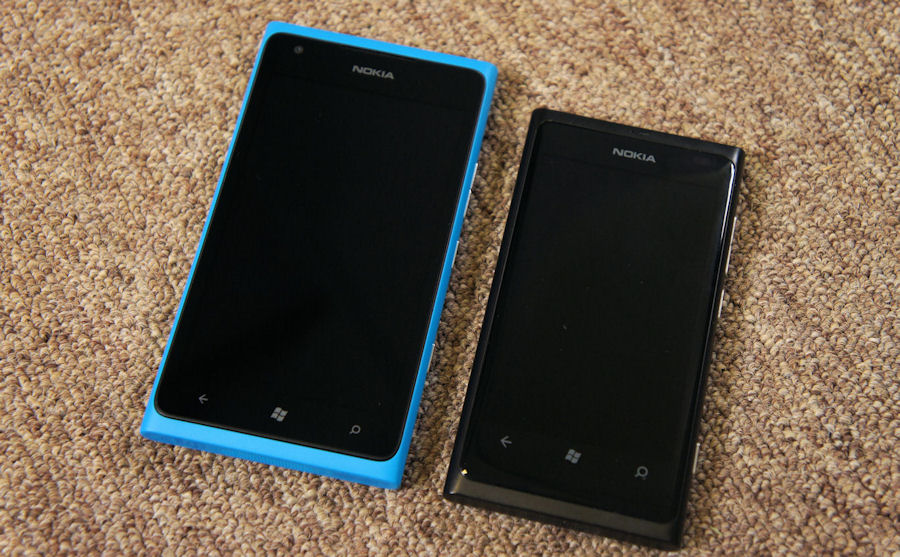
The Lumia 900 dwarfing the Lumia 800
This seemed to highlight the line that shouldn't be crossed; that is, when the user experiences physical discomfort or has to perform some sort of precarious articulation to use the phone single handed. That should be the measure of when a device is too big for someone. Conversely, if you have larger hands and you have to contort your thumb to reach the parts of the screen nearest to your hand, the device is too small for you.
A simple test to see if a phone fits your hand is if you can comfortably wrap your hand around the device and touch the tip of your thumb and middle finger without discomfort or dropping the phone.
Interestingly, for example, the iPhone 5 and the Nokia 808 Pureview get around this by having larer four inch displays with a larger aspect ratio (16:9), and so maintain a manageable width for people with diminutive hand-spans.
Is bigger better? Not necessarily...
There are plenty of precedents out there (e.g. the iPhone) that show a smaller device need not scrimp on components such as GPU, high quality camera, accelerometer, compass and even digital gyroscopes. In terms of internal component specificaiton, the main benefit from a larger phone is having space for a larger battery - everything else should be equal.
Of course, from what we've seen of the Windows Phone 8 devices so far, HTC's and Nokia's mid-range handsets are slightly smaller than their flagship devices. This isn't much of a choice though as they're all above four inches. N.B. our own Rafe Blandford reports that the Lumia 820 felt similar to the Lumia 800 'in the hand'.
Of more general concern is that the clear message from HTC, Samsung and Nokia is that a smaller screen corresponds to compromised specifications. If you accept the logic laid out in this article, then bigger does not equal better if the device is too big for you to comfortably hold. What if you want the best specifications, but the device's body is too large for you to comfortably use?
Manufacturers are desperately trying to differentiate their touchscreen slab smartphones from everyone else's touchscreen slab smartphones. Nokia has a long history, not just with Lumia but with Symbian too, of providing choice through a range of colours - something that HTC is also doing with its Windows Phone 8 devices. Also, Nokia differentiates itself through imaging prowess (in both Symbian and Lumia), and HTC is trying to do so through audio hardware in its Windows Phone 8 handsets.
I put it to you, ladies and gentlemen, that the likes of the Samsung Galaxy Note 2 are trying the patience of the market in how far the size of a phone can be pushed. I further put it to you, that the "bigger is better" trend has become tiresome. Therefore an area of differentiation whose time has come is caring for your physical comfort.
No longer should smaller phones be second class citizens, no longer should smaller phones be distinct models. Just as flagship devices are marketed in multiple colours, let them be marketed in multiple sizes too!
Just imagine a press event where the CEO proudly announces:
I give you, the Samokia Lumiv 9000X, produced in ten colours, three screen sizes, and available to buy, world-wide, on all networks from tomorrow!
Raise your glass then, here's a toast to the smaller phone, then, the form factor for the rest of us, arguably just as needed as the 5"-ish-screened super-phones currently in vogue...
