The last few days have brought up some discussion about the mobile web, the browsing and interacting with web sites from the (smart)phone browser. Some say it’s dead, some say it’s only just started. What is clear is that the difference between a 1200x800 pixel (desktop) screen and a 240x320 (phone) screen means that how sites interact will be different. How do the latest and best Web 2.0 sites measure up when using a mobile phone?
Quite well, in fact. Most of them have URLs and landing pages specifically for mobile devices so they can make the best use of a different UI to that of a desk bound user. So grab your phones, sort your bookmarks, and lets take a look at a personal Top Ten of mobile Web 2.0 sites from around the world.
 1. Bloglines
Most of the Web 2.0 sites we discuss here, and in general, are fully RSS-enabled, and these feeds can thus be read by applications to present you with the latest stories from the site. One of the delightful uses of a web site to create an online application is the RSS Feed Reader itself, and I’ve been using one of those, Bloglines, for many years now.
Is it any surprise that their mobile version is one of the first bookmarks I make on any new device? It interacts with my live story data in the same way as the main web site, so when I read something on the mobile, I don’t have to read it again on my desktop (unless I mark it as one to save). It divorces my information from the computer I am reading at the time, but it does present the information according to the device (e.g. the mobile client doesn’t have the wasteful split screen view, but two separate screens/levels for headlines/articles).
If you were going to take all bar one of the mobile sites away, this is the one I would keep.
http://www.bloglines.com/mobile
2. BBC News
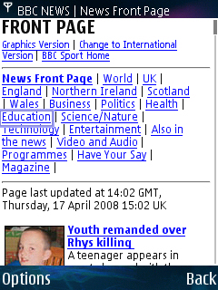
And then there is probably the oldest ‘mobile link’ that resides in my brain. The BBC’s news site has been through numerous redesigns since I first browsed the PDA version shown here on a Psion Series 3c, but that page has remained constant. The news sub-headings, the top three stories with a thumbnail, and then onto the rest of the up to date news... It is just the perfect mobile news site.
The fact that, after the latest redesign I’m now using the mobile version on my desktop, in a small browser window, is testament to the function over form that this version delivers. It's survived this long that if it were to disappear I would be distraught.
http://news.bbc.co.uk/text_only.stm
3. Twitter
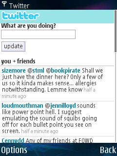
Twitter is always fun to describe – it’s a place where people can post very short messages (140 characters maximum at a time) and see what their friends have posted. Since launch, Twitter has been able to receive and send SMS messages, as well as viewing everything on their full web site. Their mobile site is one of the best implementations of a mobile site in the modern web world.
Primarily this is because Twitter is a text based medium, and all the mobile site has to cope with is a dialog box, a sign in page, and the display of the content from your friends. But it does it well, in a clear layout, and one that keeps the bandwidth costs down. For reading your friends' updates on the move, the simplicity of Twitter carries on.
4. Facebook
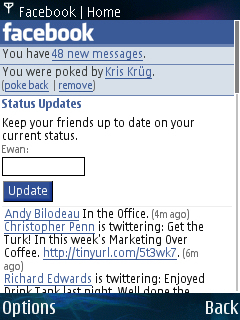
And then there’s one of the big players in the social media space, and rather surprisingly to the outside eye (although not to you, dear reader, as we progress through the article), the mobile site is actually a much better way to navigate Facebook than the main site.
The reason for this is the layout and what you are presented with. There are no intrusive adverts, and neither are there all the third party applets (such as “Who’s the Best Pirate,” “Rate My Truck,” and “Orange or Green, Choose Your Fate” [ugh - Ed]) on display here. You get the main Facebook activities, the latest status updates from your friends, a link to people wanting to be your friend, and the news feed. Other built in Facebook functions such as photos, notes, groups and events are linked at the bottom of the short page, and prove to be just as uncluttered.
The aim of a mobile site should be to get you all the information with as little fuss as possible. Facebook manages that perfectly.
5. Jaiku
Many of the services here have a dedicated mobile client, sometimes written in Java, many times written by the company (and the occasional eager third party developer), but sometimes the mobile web site version of a site provides a lot more interaction and feedback than the coded mobile client – something that definitely holds true for Jaiku’s mobile web site.
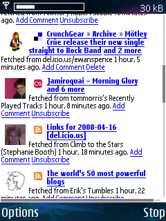
While Jaiku’s S60 application is more concerned about uploading information about you to the Jaiku server, the mobile web site brings together what all your friends are doing.
It also handles external content that people bring into Jaiku – the service allows links to blog posts, RSS feeds, uploaded Flickr pictures, and a number of more obscure services (funnily enough, one of them is Twitter). These are shown on the mobile web site as part of the regular ‘stream' of updates on what your friends are up to. Twitter is great for immediate conversation, but Jaiku shows a lot more content and what your friends have published. Through the mobile web, you’ve got easy access to them all.
Do note that Jaiku is currently on hiatus for new registrations (though it's easy to get invites, e.g. here) as it migrates to the new Google AppEngine system (as of April 2008), but it’s not as dead as some feared.
6. Flickr
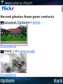
Perhaps not the most obvious mobile site, but Yahoo’s bought-in Flickr is one of the most popular destinations for people to upload and talk about their photos – including direct uploads from mobile handsets. The now obvious m.flickr.com takes you to another flat, full screen menu, similar to MySpace (see below), and it’s a simple matter for me to jump to see the latest images uploaded by my friends, or to see the discussion around my pictures.
What is good is that you really only have one level of menus – once you’ve selected what you want, then it’s straight to the content. And unlike MySpace’s mobile, you can bookmark that choice, rather than the landing page, and you’ll always be able to get back to it. Flickr is one of the more old school web site designs, but it works remarkably well on the mobile browser. And with the pictures taking up the screen space and not much more, it’s well configured as well.
7. Google Reader
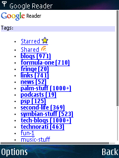
Another RSS Reader, and I make no apologies for including this alongside Bloglines. There’s nothing wrong with a bit of competition, and to be honest it would be nice if Bloglines were to take on board some of the facilities that Google Reader has – although that applies more to the main desktop based web site than the mobile version, both of which are easy to navigate and read.
As you can tell, I have a personal preference for Bloglines, but Steve and Rafe both shouted ‘Google Reader’ really loudly when I asked if they had a suggestion, and you can see why. Yet again there are clean lines, but Google Reader focusses more on getting the overview of an entire site, rather than just the individual articles, which does seem to be the style these days. Me, I’m an old traditionalist..
http://www.google.com/reader/m/
8. Dopplr
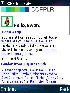
A relatively new addition to the Web 2.0 space is Dopplr, a service that you tell where you are travelling to (for conferences, code camps, events, or, shock horror, for a holiday), and it lets you know which of your friends will be in the area at the same time.
For those of us that spend a significant time globe trotting, Dopplr takes all the chance out of making serendipitous meetings – and there’s no reason to be surprised that someone is at a conference. The mobile version is a great ready reckoner on who’s expecting to be where, and there are advantages on calling this up on a mobile screen when out and about rather than a desktop. For a start, the globe trotter is likely to not have a regular desk they know they’ll always be at!
9. MySpace
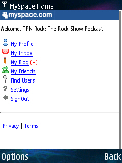
First up is the URL, just the regular MySpace URL will pick up the mobile version on your handset. As with Facebook, it’s not as slick looking as the full desktop version, but I’d still give Facebook the edge for how I use the services. MySpace goes for a more structured system of menus that branch down to the part of the site you need. It’s a much simpler look, and doesn’t look as polished as others, but it gets the job done very well, although it does take longer to get to the information you want – there’s no one page overview to bring you up to speed.
10. Mippin
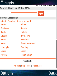
Mippin is a bit of a cheat in some respects, as it’s not a destination site, rather it indexes and reformats other web sites for the small screen, by using their RSS feeds. You don’t get access to databases and friend features, messaging or any location services, but what you do get is the ability to read sites that don’t have a mobile version of themselves in a reasonably consistent and easy on the eye style.
Also, there’s an honourable mention here for PhoneFavs.com as well (no.11?), a well put together portal, with a bit more focus on personal information rather than just replicating other web sites.
Summary
There should be no reason for a major web service to launch without a mobile version being available on Day 1, and on the evidence above I suspect this view is one held by regular design teams. It’s worth checking any service’s About or Navigation tabs to see if there is a mobile version – in some cases they’ll make a big song and dance about a new version (such as the recent announcement regarding Google’s Orkut service).
With all the talk of browsers being better able to handle full web sites, and proxy services such as Opera Mini that do all the hard work changing sites for you, some of you may have been wondering why mobile versions of these sites are needed? Hopefully you’ll have seen here that they provide a valuable service, making life easier for the user. After all, these companies are in the best place possible to make an optimized site, given that the data and the information is on their servers already!
The mobile web is here to stay in some form or another, and I for one am glad to see the two track approach is implemented where it is most appropriate. Now, all that is left is for you to tell me which sites would be on your Top Ten!
-- Ewan Spence, April 2008

