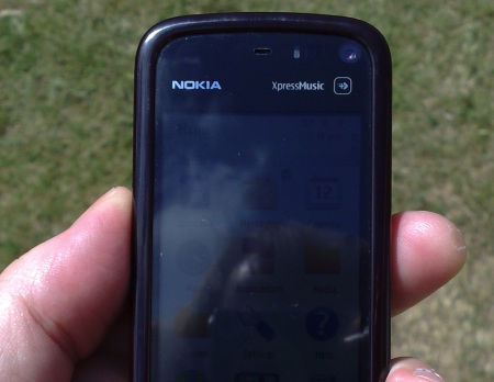
 You may remember a piece from a year ago, in which I compared the screen contrast of a number of popular smartphones of the time in direct sunlight - the results shocked many people and hopefully confirmed my continuing crusade for manufacturers to use transflective layers behind their screens.
So here I am in the park in the sun, in mid 2010, looking at the screens of the Samsung i8910 HD, of the Nokia N97, the N97 mini, the 5230 and the 5800 and trying to read their displays. The latter three are just awful, plain TFT displays which are effectively black in full sun (shown on the right). The i8910 HD fares better, but only marginally so, with its bright OLED screen not really able to complete with the sun. The N97 fares best, having a transflective layer (i.e. which reflects light back through the display) but still manages to lose a lot of screen contrast by virtue of its resistive touchscreen.
Now consider the archetypal Nokia non-touch S60 3rd Edition smartphone - most of these (but not all - think N76 and N93i - both of which I panned and both of which utterly bombed) had transflective screens and (obviously) with no touch layer to get in the way, with the result that their screen visibility in direct sun was very good. But we don't just want great visibility, the device itself has also got to measure up to modern standards - many Nokia designs, including the N80 and E61, and even the legendary N93, are just too primitive when seen through 2010 eyes.
BUT. What about the archetypal Nokia non-touch phone to rule them all? What about the iconic N95? You may remember that I looked at the wider family of N95-like devices from Nokia last year - looking at the N95, N95 8GB, N96, N85 and N86 8MP, though in fairness I could also have added the Samsung G810 and i8510, among others.
In this restrospective feature (though put into perspective in today's touch-heavy marketplace and with current realistic prices), I want to focus in more specifically on the classic N95 form and essential feature set, combining a large, transflective non-touch screen for optimum screen contrast outdoors, with top-end features. And... I hesitate to suggest this, fearing ridicule from all sides... but was the ultimate N95 really the N96? Surely that's blasphemy to all N95 believers?
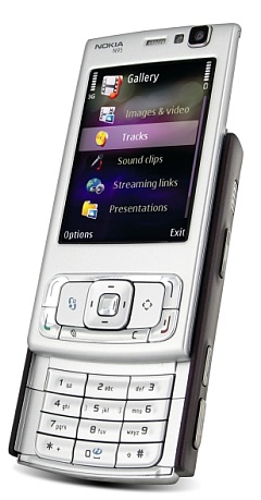
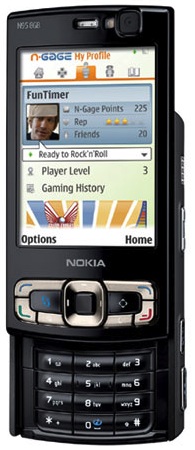
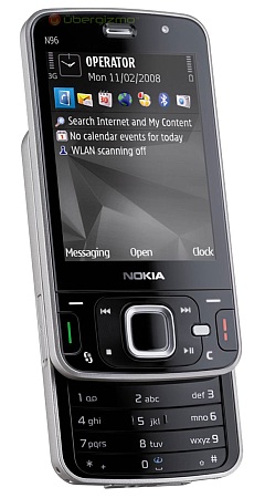
Before I draw any conclusions, let's look at the raw feature/specs list, putting the three devices head to head. Oh, and for each row, as usual and where appropriate, I'm going to pick a (admittedly subjective) winner (or joint winner, in some cases), with the table cell shaded in green...
| Nokia N95 | Nokia N95 8GB | Nokia N96 | |
 |
 |
 |
|
| Thickness of main body | 19mm | 21mm (you know, these smartphones seemed fine at the time but you have to admit they're a little chunky in hindsight?) | 16mm |
| Interface | S60 3rd Edition Feature Pack 1 | S60 3rd Edition Feature Pack 1 | S60 3rd Edition Feature Pack 2, a significant under the hood update, many aspects of which are represented in the cells below. |
| Display size and contrast | 2.6" transflective screen, good in sunlight, bright enough indoors | 2.8" transflective screen, good in sunlight, bright enough indoors | 2.8" transflective screen, similar to the N95 8GB's display indoors and even better outdoors in sunlight |
| Capacity | 160MB user storage on C:, microSD expansion only | 160MB user storage on C:, 8GB mass memory only | 80MB user storage on C:, mass memory 16GB, plus microSD |
| Performance, free RAM | Fairly brisk until the 30MB of free RAM (with v30 firmware) is used up. Ultimately limited. | 90MB free RAM means that you'll never run out of RAM. Performance pretty brisk at all times. | Average speed only, due to underclocked processor, 50MB free RAM means that you're unlikely to run out of memory when multitasking, for most average use though. |
| Graphics, multimedia playback | A TI OMAP 2420 graphics acceleration co-processor means that there's potential for iPhone-quality real time graphics - though almost no software was ever created to use this power. Video playback is generally good, helped by the chip but slightly restricted (e.g. codecs) by the older version of S60 used. | As with the N95 classic, the OMAP 2420 is a great boon, but limited by compatible software and indeed OS support. | Uses a STn8815 multimedia co-processor, which specialises in decoding video and audio streams, resulting in super video compatibility and performance with better battery efficiency. Audio playback is also of higher quality than any Nokia since the N91. |
| GPS performance | The antenna is good, but placed awkwardly at the base of the number keypad, meaning that the phone has to be slid open for decent GPS reception. | As with the N95 classic, antenna positioning compromised GPS performance somewhat. | Excellent GPS reception, even when closed. |
| Keypad/keyboard quality | A pretty good keypad, with discrete keys. Spoilt only by amateurish case surround in places. | Identical keyboard (aside from colour), though surrounds felt classier and better built. | One of Nokia's poorest numeric keypads, with plastic strips for each 'row' and very poor * and # keys. |
| Stereo speaker volume and quality | Terrific. One of the best sets of phone speakers that Nokia has made. Loud, decent quality. | Same speakers as the 'classic;. Terrific! | Average volume and quality at best, probably limited by component size inside the N96. |
| Camera quality (incl video) | Excellent stills, excellent pre-focussed VGA video, excellent sound. | Excellent stills and video, but potentially spoilt by the exposed camera glass, leading to lens flares and focussing problems in extreme cases. | Excellent stills, spoilt only by the potential for grease and scratches on the exposed lens. Dual LED flash helps low light shots marginally. Video now pre-focussed (as at v30 firmware), but spoilt by over-eager automatic gain control on the sound. |
| Extra hardware controls and buttons | (Flat) Top slide multimedia controls, plus a dedicated 'multimedia' key. | Multimedia controls were domed, making for much easier access 'sight unseen'. | Top slide multimedia controls, sadly flat, as on the N95 classic, plus an extra set that light up around the d-pad if media is playing when the slide is closed. Plus a dedicated (and not much liked) 'multimedia' shortcut key. Plus a useful keylock toggle. Plus gaming action keys on the top slide, though these aren't used much these days? Plus (getting to be a long list, this....) a keylock toggle, very useful indeed. |
| Battery, power | 2mm charging, 950mAh battery | 2mm charging, 1200mAh battery. A much needed capacity boost, the battery king in the N95 family. | 2mm charging, 950mAh battery |
| Connectivity to desktop | Slow USB (1MB/s) | Slow USB again. In fact, slower, given that the internal 8GB mass memory was significantly slower to write to than a microSD card | High speed USB (4 to 6MB/s) |
| Unique extras | DVB-H TV receiver, though not used in most countries, sadly. Kick stand for propping the N96 up at an angle. | ||
| Updatability | Via Nokia Software Update, backup/restore needed | Via Nokia Software Update, backup/restore needed | Via NSU or Over The Air, has User Data Preservation too |
| May 2010 pricing (unlocked, SIM free), value for money rating? | Hard to find brand new. Around £150 on clearance or 'refurbished', £80 second hand on eBay | Rare brand new. Around £220 on clearance or 'refurbished', £120 second hand on eBay | Still available new if you look around. Around £350. But only £100 second hand, perhaps due to the N96's reputation, good value for money bought this way!? |
Perhaps not surprisingly, the newer handset has the most 'wins' here. Using the popular analogy, it's a case of 10 steps forward and five back for the Nokia N96 but it is, objectively, the better handset by any measure. And just look at that price on eBay - there has never been a better time to pick up an N96 as a backup or replacement handset second hand.
However, there's also a certain 'hero' label that's rightly applied to the legends that are the N95 and N95 8GB. Despite early software issues (mainly on the 'classic'), they were streets ahead, at the time, of the rest of the phone world in terms of sheer convergence. So I suspect that if I were to offer you, the reader, the choice between an immaculate N95 8GB and a similar condition N96, you'd be likely to go for the former, despite it being out-gunned. Your head would say 'N96' and your heart would say 'N95'!
As an aside, there's also an interesting styling aspect to consider here. The N96 design language was widely criticised by some at launch (the same applied to the N81), but I was fascinated to see James Burland and others point out that the new Apple iPad and leaked iPhone HD use the same design cues and styling. Obviously, it's not Apple's attempt to copy the N96(!) - but the superficial similarity is striking. So maybe the N96 doesn't look as strange as it once did.
But back to my main theme - screen contrast outdoors and a smartphone for all seasons. You're out and about and you're lost. Or you need to look something up on the web. Or you want to catch up on Twitter. It's a lovely sunny day and your mood is lifted when you realise that you don't have to squint at your smartphone's screen. The large 2.8" transflective screen of the N95 8GB and N96 (and indeed the E61 and E61i, to be fair*) lets you see everything you need to without blacking out or simply reflecting your surroundings.
* plus the E90 has a whopping 4" transflective screen, but I do accept that this isn't exactly a mainstream form factor!
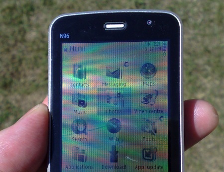
(as noted in my original sunlight piece, actually photographing what the human eye sees in the sun is tricky! This will give you an idea of a 2.8" transflective screen at work though - this is in the full reflected sun, i.e with the sun directly behind and above)
Sunlight contrast is important to me. Which is why I still hold an extremely soft spot for the triumvirate of handsets above. What about you?
Steve Litchfield, All About Symbian, 9 May 2010
