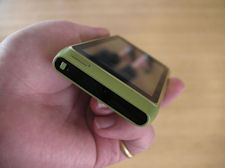
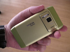
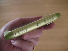
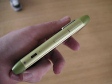
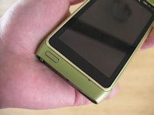
At first glance, the most striking design characteristic of the N8 is the prominence of the screen. This might sound like an obvious thing to say about a touch-only device, but what I mean is that the screen stands out on its own, rather than feeling part of a seamless front. The primary reason for this impression is the gently tapering top and bottom of the device, together with the minimalist homekey and the colour change between the screen's bevel and the device's casing. However I would suggest the stand-out feature of the design is in fact the unibody style casing of the N8, which is made from anodised aluminium.
This unibody design is the reason that the N8's battery is non-user removable. There have been a few comments that the N8's battery is removable and, technically, that is true. To replace the battery you will most likely need to partially disassemble the device by unscrewing at least two screws with a Torx screwdriver (not found in most standard toolboxes) and be very careful not to strip the threads (the most common accident when taking phones apart). As such, replacing the battery is certainly not practical day-to-day and the majority of people will shy away from doing this themselves at any point in time.
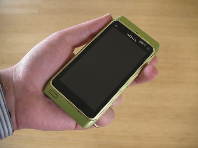
We asked Marko Ahtisaari (Head of Design at Nokia) about the absence of a user replaceable battery and he said that the "overall design concept overruled it" and that the decision had been take to "simplify the design's construction". "This line of manufacturing will evolve", he added, suggesting there are more unibody designs on the way. Later he noted that simplicity and attention to detail have "driven the entire package" and with the N8, Nokia were "making things differently". That's a fair summary - the N8 is something of a design departure for Nokia, although it does retain familiar Nokia design elements and language - it has that distinct 'tell its a Nokia from across the room' familiarity.
Size wise, the N8 (113.5 x 59.12 x 12.9mm) fits in somewhere between the X6 (111 x 51 x 13.8mm) and the N97 (117.2 x 55.3 x 15.9mm). The N8 is a little wider than some of Nokia's previous touchscreen smartphone, but this is offset, to an extent, by the rounded edges. My impression was that it should still be fine for the majority of people to use the device one-handed - a property which I feel is rather underrated in most device reviews. The device feels much more 'slate' like than some of Nokia's earlier devices - primarily because it actually is thinner, but also because it has a cool metallic touch rather than the usual warmer plastics.
In the hand, the most surprising thing about the Nokia N8 is its weight; it feels a lot lighter than I was expecting. It this respect it is reminiscent of the Sony Ericsson Vivaz. This quality is likely thanks to the all in one construction; the aluminium casing presumably has a structural role to play in addition to the usual protective and cosmetic roles. It also feels finely balanced, but that is a difficult characteristic to judge without extensive usage.
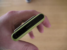
The use of anodised aluminium as the primary external material on the N8 is very effective (previously used with great success in the E52 and E55). Not only does it let Nokia release the device in a range of colours (a coloured dye is mixed in during the oxidisation process), but it should also be more robust and scratch resistant than the plastics used in earlier Nseries devices. At the top and bottom of the device there are small pieces of plastic; presumably this will help with aerial placement and optimisation for aerials for the five-band 3G radio, quad-band GSM radio, GPS receiver, FM transceiver, WiFi radio and Bluetooth radio. The top of the device is also the location for the power button, HDMI-out port and power button.
The sides of the device house a number of buttons and slots; on the right you have volume/zoom keys, the slider lock and a camera capture key (which had a particularly satisfying action), on the left, you have the microUSB port and slots for a microSD card and SIM card. All well integrated and no annoying plastic flaps or half-hearted buttons here.
In contrast to earlier Nokia Symbian devices, there's only a single button on the front of the device. The home button is sited on the lower left side; I'm not completely convinced by the positioning close to the edge or by its small size and I rather liked the diagonal arrangement on the N97, but without actually using the device it's not really fair to criticise this.
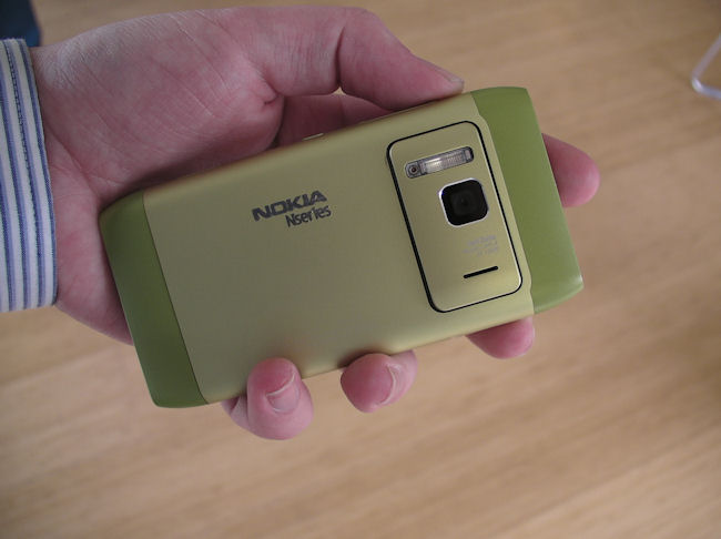
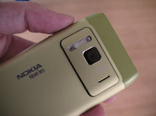
The styling on the back of the device is a reflection of the front, with the camera module sharing the same shape (rotated ninety degrees) as the screen and accompanying bezel on the front of the device. It is this symmetry and attention to detail that is the hallmark of the N8's design. In pictures, the N8's camera 'bump' looks quite prominent, but in reality it's much less prominent. It does mean that the device does not lie flat on a surface, instead it lies slightly tilted (but doesn't wobble). Given that the bump enables the N8's cutting edge camera, it is a more than acceptable design compromise.
In terms of overall build quality, the N8 is very promising; as you would expect, it is a big step up from the 5800 and X6. The unibody style cuts down not only on the overall thickness, but also means there are no extraneous creaks or squeaks. Subjectively, it feels like a much more expensive device and, in general terms, is much closer to design ideas seen in devices like the iPhone, HTC HD2 and Nexus One.
An apt comparison might be the step up from the E61 to the E71. In pure design terms, there's not anything that is startlingly new in the N8 (you need to look inside the device for that), but the individual elements do feel more finished and there's an understated elegance to the overall styling.
It's not really possible to come to any overall conclusions about the N8 just by looking at the hardware design and 'feel in the hand' for a limited period of time. However, I can confidently say that it is very unlikely to be a weak element in the overall package.
As a reminder, the N8 pictured in these photographs is a prototype, which explains the C0 label on the top left of the device. There may be small changes before the release, though these tend to be very minor tweaks.
Nokia N8 mini-gallery
Click through for the full size pictures
We'll be bringing you continuing coverage of the Nokia N8 over the next few months and a full review when review hardware is available.
See also
Nokia N8 - content creation and consumption on Symbian^3
The Nokia N8: Imaging champion with a five year legacy
The making of the Nokia N8's camera
The Nokia N8 seen through YouTube videos


