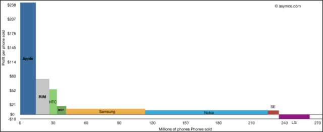
The cliche is that a picture is worth a thousand words, but I have to hand it to Horace Dediu at Asymco. His graph of "sales vs profit per handset" not only shows how profitable some of the major manufacturers are, but also how Apple and Nokia are working completely different strategies in sales.
It's also a good example of the Long Tail concept and how there is value both at the left of the graph (where Apple is), and in the shallower part of the curve on the right (Nokia's location). If you ever needed a quick visual look at how the companies are different, here it is.