Review: Nokia N8: part 4 - Messaging, Email, Web
In part 4 of our Nokia N8 review, I look at the email system, messaging improvements and the new multi-touch-aware version of Web in the launch firmware. Importantly, I also look in detail at the various methods of text input and correction, essential to efficient use of these applications. See also part 1 (hardware), part 2 (camera) and part 3 (multimedia and games) of our definitive N8 review.
Revisiting text entry
For obvious reasons, text entry is a critical element of messaging on a mobile device. We discussed the N8's text entry options briefly in the first part of the review, but they are worth revisiting here. You've essential got three options: alphanumeric 12 key (in portrait, also known as ITU), QWERTY (in landscape) or an external keyboard (either via USB or Bluetooth). It's worth noting that there may be changes to this in future firmware versions and that Swype should be available for Symbian^3 shortly.
Each of these options is suited to different occasions. External keyboard support is a welcome extra, but in most instances will be impractical for portability reasons. The alphanumeric 12 key method can be used one-handed and is well suited to short pieces of text entry; it's also familiar to anyone who has used a mobile phone before. Existing Symbian^1 (e.g. Nokia X6, 5800) users will notice that there's been a layout change in the alphanumeric keyboard. This does take a bit of getting used to. For example, those expecting to find the delete key in the upper right-hand-side will have to adjust their aim. I do wonder whether it might not have been better to place the actions keys along the top, rather than the bottom. I've seen a number of comments expressing a desire for a QWERTY keyboard in portrait mode and agree it would be good to have as an option. However, it should be a choice, not a replacement. In the absence of choice, ITU is preferable, given that a QWERTY keyboard is available in landscape mode.
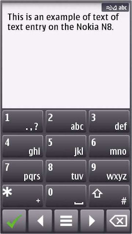
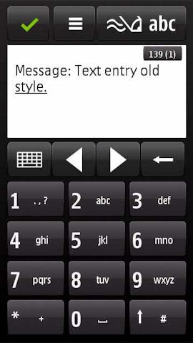
The new alphanumeric keyboard (left), compared to the one from Symbian^1 (N97, 5800, etc) (right)
The QWERTY keyboard offers, potentially, higher entry speed and is more suited to longer pieces of text. In part 1 of this review we were slightly critical of the auto-correction, but both Steve and I have had to revise our opinions. It seems to improve with use, learning as it goes, so the more you use it, the better it gets. There is, of course, room for improvement, with multi-touch support being an obvious example.
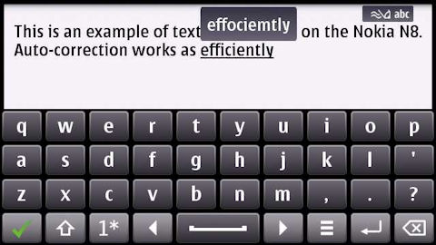
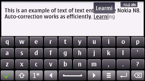
Auto-correction (top) and auto-completion (bottom) example
To get the most out of QWERTY text entry it is absolutely critical that you adjust the settings to your personal preference; most important is 'Text correction mode' where you are offered a choice between 'Show entered' and 'Show suggestion'. The latter of these will use auto-correction suggestions automatically and is arguably faster and more efficient; the former requires you to tap on a suggestion to accept it. It's also worth turning on 'Word auto-completion' and knowing that pressing return (or right arrow), rather than space, on the keyboard accepts a completion suggestion.
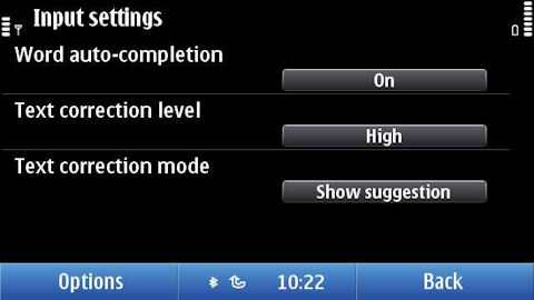
There are times when the UI makes text entry more difficult that it needs to be. This is because both keyboards take over the whole screen. Sometimes it would be preferable to 'slide up' the UI into the space above the keyboard. Symbian^3 does actually have support for this in the form of the split view input method, but it has not been widely implemented.
In an earlier part of this review, one of our commenters asked whether it was possible to respond to email and forward it to three people, while holding an umbrella and standing on one leg. I'm pleased to say that this is indeed possible(!); Symbian^3's menu driven interface helps here, but it turns out the critical part of the activity is entering text. This test criterion may seem like a joke, but it illustrates an important point. If you've only got one hand it is much easier entering text using the ITU keyboard than it is using a full QWERTY keyboard. The one handed use case can be easily overlooked when you're sitting at a desk reviewing a phone, but in real world, usage on the go is critical.

We do these tests, so that you don't have to (please excuse 'fake' rain)...
There's a certain amount of subjectivity here, something that applies to text entry in general. However, bearing in mind both the screen ratio (generally meaning a proportionally narrower screen) and the presence of the ITU keyboard, I think it is fair to say that the N8 is more suited to one handed usage than competing devices. Well worth remembering if that's an important factor for you.
Messaging
The N8's Messaging application will be familiar to anyone who has used a Nokia device before; depending on your perspective, that's either a good or a bad thing. There are relatively few changes to existing functionality, but there is a major addition in the form of a Conversation view. This displays text messages between you and a contact in an IM-like style, with speech bubbles for each text message. It is a great way of displaying text messages exchanged in a rapid fire way over a short period, as it allows you to keep better track of what has been said.
This functionality has become increasingly popular as unlimited text plans become more common place and is widely available on other platforms. It was previously available as a beta on a selection of older Nokia phones, so it good to see it become a standard part of Nokia's Symbian platform implementation. There is a setting (Options -> Message view) that lets you choose the default display mode for new messages: Conversations or Inbox. It's good to see this, because, for all the popularity of IM style views, there will always be those who prefer the basic list style messaging inbox.
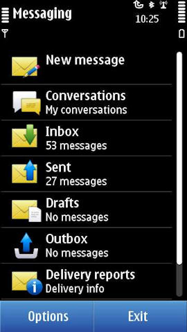
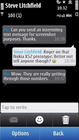
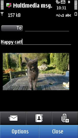
The core message creation functionality is handled by Nokia's unified SMS/MMS editor, which offers fine control over the contents of messages and intelligently selects the appropriate message type based on what's entered in the editor. These days there's little to choose between the competing MMS editors, but Nokia's remains one of the easiest to use. Particularly helpful is the ability to create audio messages, ideal for on the go usage.
One peculiarity of Messaging, compared to other built in applications, is the ability to set the font size used in the application independently (small, normal or large) from the overall system setting (found in Settings -> Display -> Font size). It is a welcome addition to Messaging, where it has clear benefits (small: more information on screen, larger: easier to read for those with poor eyesight), but it's a shame it is not available more consistently across the standard applications (Contacts and Calendar, in particular, would benefit from this addition). Irritatingly, the Conversations module does not follow the Messaging setting for font size because, technically, it's actually a separate application.
Email is a vital function is any modern smartphone, so it's important to assess what kind of experience the N8 delivers. Previous Nokia devices have included a basic email client within the Messaging application. In recent years this has been supplemented by 'Nokia Messaging' (launched as Nokia Email service in the summer of 2008), a service which added 'push' to any email account and used its own client, which was made available out of the box on a number of Nokia devices, starting with the Eseries range. However, this could be confusing as there were effectively two different email clients on the phone.
With the N8 this confusion is removed as there is no longer any email functionality in the Messaging application. Instead an evolved version of the Nokia Messaging client, called Mail, becomes the main email application. Mail has a plug-in architecture which allows various email services to be supported; out of the box there's support for Mail for Exchange and Nokia Messaging. In due course other services, such as Lotus Notes Traveler, are likely to be added.
As noted above, compared to Nokia's earlier smartphones, there is a move away from integrating email within the Messaging application. Normally I would not advocate adding an additional access method, however, in this case the addition of shortcuts to email inboxes in the Messaging application's main view list, as implemented in E72 and other phones, would be a welcome nod to a unified messaging approach.
Email setup is incredibly easy. Out of the box, there's a widget on the homescreen that invites you add an email account to the device. This takes you to the setup screen where a number of popular services (Ovi Mail, Yahoo! Mail, Google Mail, Windows Live Hotmail, Mail for Exchange, and others) are available, giving a good sense of familiarity. In most cases, thanks to the clever setup wizard, you'll only need to enter an email address and password, the rest of the necessary email server settings will be filled in automatically. Mail allows you to add up to 10 different email accounts, which should be more than sufficient, even for the power user.
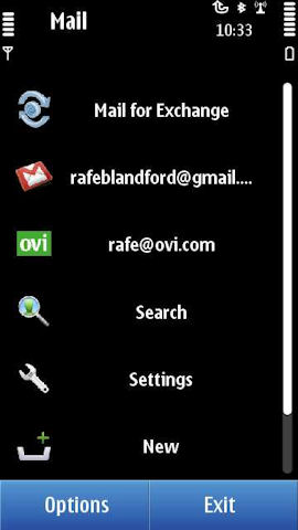
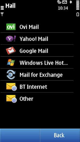
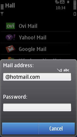
By default, most email accounts will be set up to use Nokia Messaging on the backend (i.e. with push) in a process that is completely invisible to the end user. Push performance is impressive, with emails arriving faster on the N8 than on competing devices with similiar set ups. There are other benefits to using the Nokia service, especially around battery life, but users may want to be aware that email will be delivered and sent via Nokia's servers. While POP and IMAP support is available, it is well hidden (if you really must use plain IMAP or POP, the easiest way to access it is to enter an incorrect password when setting up an email account - extra dialogs then appear to clarify what's wrong).
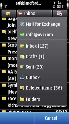
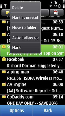
The Mail client itself is well laid out, with a sensible balance between information displayed on screen and readability. A single touch opens up an email for viewing, while a long touch brings up a menu with various other actions (Delete, Mark, Move to folder, etc.). General performance is good with quick transitions between screens and fast scrolling though lists of emails. A drop down menu offers quick access to other email accounts, folders (Inbox, Drafts, Sent etc) and sub-folders. Good sub-folder support will please those who apply filters to incoming email on the server side, although they do not always seem to be in-sync (often refreshing their contents after you access them). Also welcome is the ability to sort email in various ways (date, sender, subject, flagged. unread, attachment), which significantly aids inbox navigation. There's also a basic search utility, although it is frustratingly slow, especially if you have a large number of sub-folders.
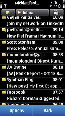
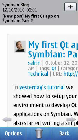
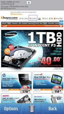
Viewing of email is much improved, thanks to the addition of integrated HTML support. This includes multi-touch zoom functionality, making it easy to read even the most complex HTML emails. Large emails can cause some slow downs (usually no more than second or so). Attachment handling is also first rate, with the onboard applications able to handle (viewing) Microsoft Office, Adobe PDF and ZIP files with ease. Similarly, composing or replying to email works well, although the UI can feel a little clunky, thanks mainly to the text input method (e.g. several stages to enter and look up and email address).
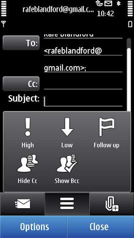
Outside core email functionality, there is support for generic priority/notification flags ('starring' in Gmail and other webmail services). The client will also sync the read/unread status of emails to the server, giving a more consistent email experience between desktop and mobile and, if you're using Gmail or Hotmail, there's support for contact server look up (i.e. looking up your a contact from your webmail's address book). Email integration on the device's homescreen is also well handled, with the ability to add an email widget for any account that has been set up on the phone. This allows an at-a-glance view of the status of multiple email accounts at the same time, as well as offering quick access to the inbox of the email account in question.
The N8 offers good basic Mail for Exchange support, including auto-configuration where supported by the server. Nokia's Mail for Exchange is a mature application and I've not seen any problems over the last fortnight - it has, without any intervention, been quietly running in the background to keep everything in sync. On the downside, you can only add one Mail for Exchange account to the phone. Multiple Exchange account usage is becoming more common, in part because Google uses it as a sync technology, so it would be good to see Nokia address this use case in the future.
Overall, the email functionality of the N8 is good. There's a particularly big improvement for those coming up from earlier Nokia devices thanks to the new Mail client, and improved Nokia Messaging back end. The approach Nokia has chosen to taken has a broader reach and is generally more flexible than competitor platform's email solutions. There are a few instances where specific use cases (e.g. multiple Exchange accounts) are better implemented elsewhere, but these are the exceptions rather than the rule.
Particularly impressive is the broad reach of the email solution. Enterprise users are catered for by the Mail for Exchange functionality. Consumers see familiar brands (Gmail, Hotmail, and Yahoo Mail) during the set up stage and many more services also supported in terms of expedited set up. Those wanting to set up a brand new email account are also catered for via Ovi Mail. This means that almost anyone should be able to get email up and running on the N8 easily, and that's an impressive achievement. The Nokia Messaging backend is similarly impressive; not only does it add push to any email account, it is also more battery friendly than other solutions.
Performance wise I did notice a few slowdowns. This seems to apply more frequently to accounts with lots of messages coming, but to be fair, this is something I've noticed on many mobile devices. The start of a Nokia messaging sync session also seems to slow the whole device down for a few seconds. Given the large number of potential set-up scenarios and usage patterns it is difficult to give a definitive statement on performance. However, despite the fact that there does seem to be room for further optimisations in the Mail application, the majority of users are unlikely to face any major performance issues.
Web
The N8 uses the same version of Web, 7.2, as the most recent Nokia devices (e.g. X6, C6). While there are a number of small changes, most notably the support for multi-touch 'pinch-to-zoom', the core rendering (WebKit 525) and JavaScript engine and UI remain the same. The vast majority of pages render without any problems, with the occasional glitches usually being down to the limited screen resolution inherent in mobile devices. The browser supports Flash Lite 4 (very similar to Flash 10), which means no problem playing back Flash-based videos on any website. The debate on Flash will run and run, but for the time being it remains a necessity on many websites. Compared to other leading mobile browsers, JavaScript performance is poor (best seen in benchmarks), which results in slow performance in web based applications and on complex web pages.
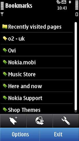
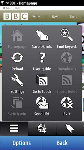
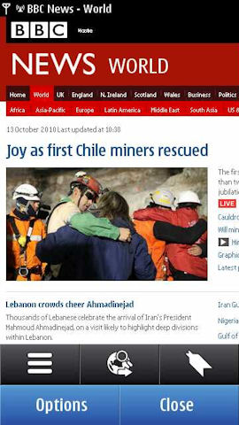
The introduction of multi-touch zooming on the N8 complements the earlier introduction of kinetic scrolling. These two technologies work far better on capacitive screens than they do on resistive screens; indeed, web browsing is probably the activity that gains the most from having a capacitive screen. Therefore, for those upgrading from previous Nokia devices, the use of a capacitive screen in the N8 will likely be the single biggest improvement in the web browsing experience (as it was on the X6, arguably). The pinch to zoom functionality works as advertised, but can be a little jerky and does require you to use both hands (one to hold the device, one for the gesture itself). The double tap to zoom usually works more efficiently and can be done one-handed so, depending on the user, may get more day to day usage.
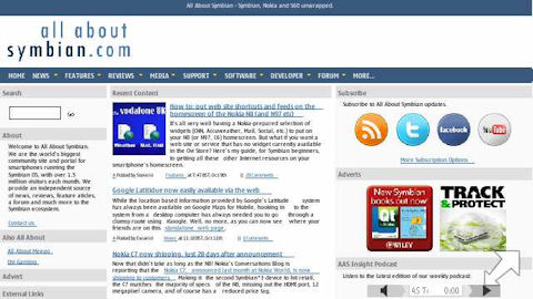
Overall performance is much improved over the Symbian^1 devices, thanks to the extra resources (processor and RAM, all detailed in part 1 of our review) available. Critically, there are no 'out of memory' messages and even in heavy browsing sessions other applications remain open in the background. Loading times are a little quicker, but what really stands out is the smoother scrolling and the ability to navigate around the page more quickly. As on earlier Nokia devices, there is something of a dichotomy, with a split between the browsing of mobile websites and those built for the desktop. On the mobile web side of things the browser offers superb performance, arguably the best available on any device, thanks to quick starts and fast basic rendering. Desktop browsing while still good in general, can be sluggish once web pages enter the multi-MB size (surprisingly common these days, sadly). So the overall performance and experience will very much be dictated by the types of websites you browse on the phone.
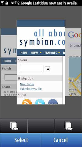
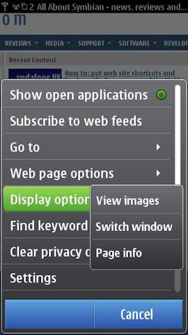
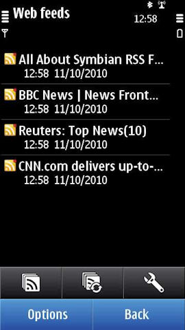
While the browser is one of the weaker elements of the N8's software suite, but it should be good enough for most people. Those wanting more would be well advised to download Opera Mobile from the Ovi Store. Theoretically the presence of a default application setting (Settings -> Application settings -> Default applications) lets you change the default browser from Web to Opera, but unfortunately it is does not work (it's unclear who is at fault here).
Web on the N8 does offer significant performance improvements over Symbian^1 devices, but, in some areas it does not quite measure up to its Android and iOS competition. Part of this is down the older version of WebKit used, but more critical is the lack of text reflow on zooming and a UI that has changed little since the introduction of the Nokia WebKit browser five years ago and therefore feels a little clunky.
As such, the lack of a major upgrade in the step up to Symbian^3 is disappointing. However, in part, this reflects the fact that the development of key applications is now separated from the platform itself. A new version of the browser is due out shortly (a month or two) and should be delivered in the N8's first major firmware update. Subsequently, we can expect to see a shorter gap between browser releases than has previously been the case.
Social Messaging / Networking
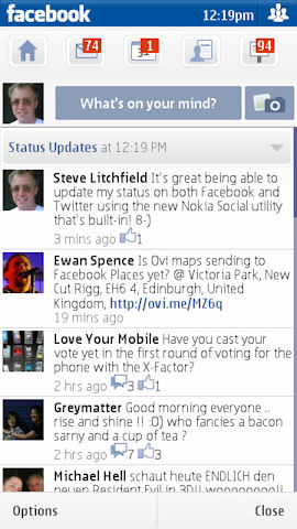
Nokia Social (networking) is a new addition to Nokia's software suite and offers basic social networking access, with the main focus around reading and sending status updates. Currently, Twitter and Facebook are supported, but additional services are expected to be added in due course. Set up is a breeze; you just need to enter the appropriate username and password. Information can be viewed either in an aggregated view (all activity) or individually by service. Effectively, each service has its own mini application, with the functionality changing depending on the service being used.
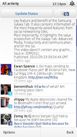
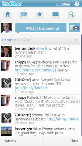
The Twitter implementation is basic, but functional. The core Twitter functionality - reading and writing tweets, viewing mentions and DMs is cleanly implemented. So too are image uploads (via TwitPic, albeit with huge downsampling), but bizarrely the ability to retweet is not. For light Twitter users it is perfect usable, but adds little over the mobile web Twitter site or third party web-based services such as Dabr. Power users will want more and will almost certainly end up using the ubiquitous Gravity or another client.
The Facebook functionality is richer, with the core Facebook services (status updates, messages, events, profiles and photos) supported. The implementation will be familiar to those who have used Nokia's existing Facebook client application because it is effectively the same application, albeit in a different wrapper.
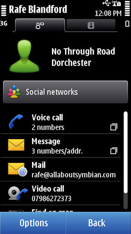
Integration with the Contacts application is limited to a shortcut in individual contact entries and even this requires manual setup. It's a shame that a deeper level of integration and basic automation, such as that seen on the Nokia C5, was not implemented. While social integration will not appeal to everyone, it is becoming an important differentiator.
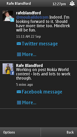
Performance is sluggish, in part because there's a large amount of data being downloaded over the air, but also because of the use of Web Runtime (WRT) as the basis for the implementation. WRT performance has been improved in Symbian^3, but there's still a way to go. Also frustrating is the break with Symbian^3 style guide, which gives a feeling of inconsistency and doesn't seem to bring any great benefits.
More details, including a visual walk through of the application, are available in Steve's feature article on Nokia Social that we published late last month.
Instant Messaging
In early previews of the N8, Nokia Messaging for IM was present on the device. However, this has been left out of the launch firmware. It’s not clear why, but it seems likely it will be made available via Ovi Store or included in a future firmware update. In the meantime there are several third party options that can be used instead, including Nimbuzz, Fring and eBuddy.
Data Connectivity
Data connectivity is a crucial part of the user experience of any application or task that makes use of the Internet, with email and web browsing being prime examples. Previous versions of Symbian were well known for their frequent 'are you sure you want to connect?' prompts. The paranoia around users receiving unexpected data charges meant these popped up far more frequently than they should have done. With more people now on flat rate data or at least with more controlled charges, a key priority for Symbian^3 was the delivery of 'one click' connectivity.
In practice, most of the time you will not even 'one click', the device will simply connect, without any user prompts, as necessary. In implementation terms what you see is a small notification, in the top left corner of the screen, advising you of a connection event, which disappears after a few seconds. The applies to all the in built applications and most third party applications. On rare occasions you will still see a connection prompt, but is limited to applications (mainly third party) with explicit access point settings that override the system level connection controls.
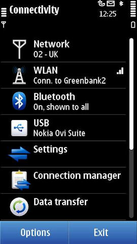
Connecting to WiFi hotspots can be done in a number of ways, but the easiest is to use the WLAN Wizard homescreen plug-in. Once you've connected to an access point it will be rembered for future usage. Connectivity settings and controls, which offer additional information and fine control over connectivity, can be quickly accessed via the status box, which pops up when you touch the top right of the homescreen (or via the Settings application).
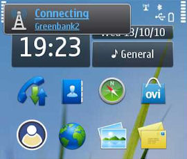
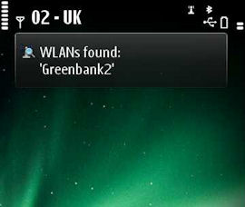
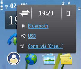
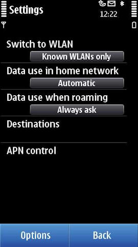
The Connectivity settings dialog consolidates all the connection settings and utilities into a single location. Here you can control the behaviour of WiFi (manual connection only, or automatic connections to known networks) and configure 'Destinations' (access points configurations and storage). While the N8 should automatically connect to WiFi when it is available we found that this does not always happen. Specifically, if you lose a 3G signal while you are actively communicating over the network the connection goes 'on hold' and even if there is a WiFi connection available it will not switch to it. Part of this does seem to depend on the way the 3G network is configured (varying from network to network and even base station to base station). If you do run into this problem, the quickest way to get round it is to close the application using the connection and open it again. However, most of the time, the switch to WiFi does happen seamlessly.
There are also specific settings for 'Data use in home network' and 'Data use when roaming', which can be set to 'Automatic' or 'Always ask' (i.e. turn data connection prompts on or off). Given the cost of data roaming it is a good idea to leave the roaming setting on the default 'Always ask' option. It gives you greater control over when the device connects and should go a long way to preventing unexpected data costs when roaming. If you are on a limited data tariff you may also want to consider turning on prompts for your home network too.
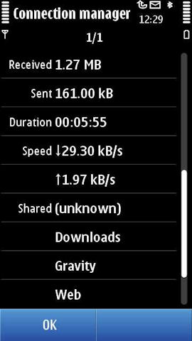
The Connection manager (third screenshot below) allow you to control (close) and view more information (speeds, amount of data used, applications using the connection, power usage, and so on) about currently active connections.
Connectivity support on the hardware side is excellent. The WiFi supports the b, g and n network types and a well positioned aerial means the N8 has good WiFi range. The real highlight though is the penta-band 3G radio, a world first, which gives the N8 the ability to connect to all five of the main 3G bands (850/900/1700/1900/2100). The pentaband 3G radio is truly an impressive technical innovation and testament to Nokia's expertise in this area.
In practice this means, operator agreements permitting, wherever there is a 3G signal, the N8 can use it. It is particularly important in the USA where T-Mobile and AT&T operate on different 3G bands. As a result of the penta-band 3G radio, there's no need for NAM-specific models, as was the case with previous Nokia smartphones. And, as you would expect from a Nokia device, the N8's also very good at getting and holding onto cellular signals, comfortably surpassing many of its rivals.
Summary
For Messaging, Email, Web and Social Networking, the N8 can, once again, be viewed in two ways. Existing feature phone or Nokia smartphone users will find much that is familiar in style terms, but see a big step up in terms of functionality, performance and user experience. Those coming from other platforms may find some of the idiosyncrasies of Symbian annoying, but should also benefit from some of its underlying maturity (e.g. leaving push email on all day is unlikely to ever be an issue). Ultimately, none of these applications are going to cause users to jump over from Android to iOS, but equally, the reverse is also true, i.e. these apps won't cause anyone to run away screaming.
The addition of the Conversations view to Messaging is overdue, but nonetheless welcome. Text messaging is a core part of any phone experience and, in general, the N8 is well served by Nokia's mature and well thought out Messaging application.
Email functionality is similarly well served. The updated client is well laid out and easy to use. It is particularly efficient at handling multiple email accounts efficiently. Nokia's service-agnostic approach pays real dividends, especially during the setup process. Outside of the push functionality, the advantages of the Nokia Messaging backend may not be immediately apparent, but the efficient power management has a real impact on battery life.
Web is one of the N8's weaker elements, but it is more a case of lacking in elegance and polish, as opposed to lacking in functionality. The updated browser, which should arrive later this year, should improve matters considerably, and it'll be well worth re-assessing the N8's browsing capabilities once it is available. Even in the current browser there are a couple of real positives too, notably the Flash Lite 4 support, RSS feeds and exemplary mobile browsing capabilities.
The social networking functionality needs work, especially in the areas of performance, integration and styling, but it does provide an acceptable minimum.
In part 5 of our N8 review we'll be taking a closer look at Symbian^3 in day to day usage, considering performance and looking at additional applications and UI features. We'll also be covering Ovi Service integration, from switch on to daily usage.
Rafe Blandford, All About Symbian, 14 October 2010

Reviewed by Rafe Blandford at
