Review: The Nokia C6-01, four months later
Nokia's C6-01 never seemed to catch the popular mood in the same way the E7 or the N8 has, but it has its dedicated fans. I'm one of them, and it's time to look back on the rise (and fall) of the C6 in my pocket, How did it get there, why did it stay there so long, and ultimately what pushed it out and into the “spare” pocket of my rucksack?
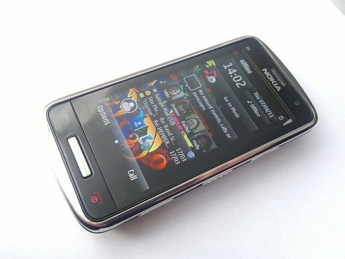
Right then, the Nokia C6 (okay, I really mean the Symbian^3-powered C6-01, but let's go with C6 for the rest of the article, okay?). Announced at Nokia World last year, this was the device I zeroed in on as wanting to cover. While the rest of the team were scrabbling for the N8, I was more than happy to wait for this diminutive phone. To me it seemed to fit in a great space, it was running the latest Symbian OS, it was the size of the N95, albeit with a touch-screen rather than a slide out number pad, and because of the size and metal construction, it appeared to be leaning heavily towards the “indestructible” pub phone; a device you could happily subject to a lot of punishment, throw around a bit, have beer spilt on it, and trust that it would still work.
Having got my hands on it, I started the review late last year (part one is here, the rest are linked at the end of that piece) and now it's time to look back on the C6 and where it fits in the smartphone world.
Looking over the whole space, Nokia positioned the C6 to be the mid-range phone of choice for the networks. It's not threatening to customers like the bulk of the E7 or the camera bulge of the N8, it's just there. But it promotes the network services and pretty much ensures that you're going to be buying a data plan. A glance at the UK networks and you can find it on contract for no up-front fee and around £15-£20 a month. That's a space that has high volume, a lot of interest, and populated by people that just need their phone to work.
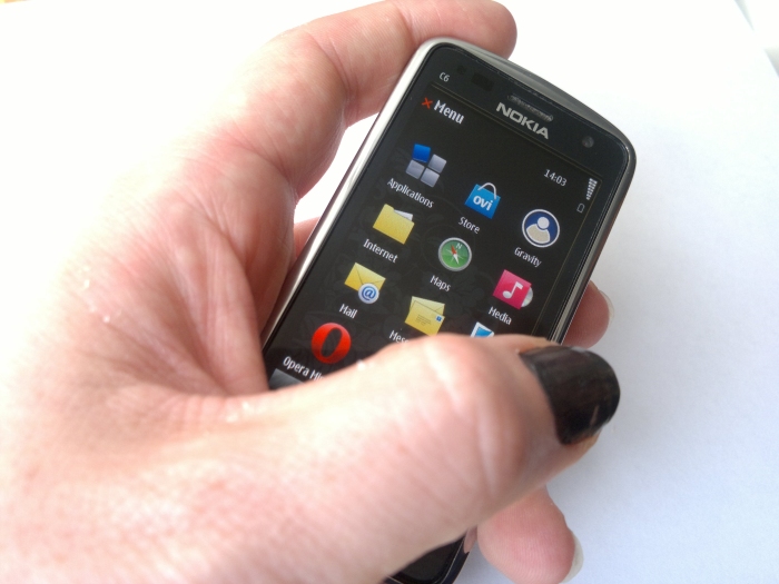
There's no doubt that the C6 does just work – any issues in Symbian as a consumer grade operating system have been, in my opinion, buffed, polished and upgraded away, although there are issues with some of the actual applications (do we, yet again, need to cover for the Nokia Web browser and wait for “just use Opera” comments to appear after the article? Thought not), Symbian^3 is suitable for the regular end user. Are there quirks? Yes there are, but there are also quirks in iOS and Android as well.
Ah, Android – the other competitor in this mid-range smartphone market. A few years ago there would have been very little to challenge in this space of cost-effective, internet-connected devices. Witness the runaway success of the Nokia 5800 as a case in point. I suspect if we look at the numbers, the volume of devices sold in the midrange will be in line with the expansion of the market, but shared out around a few more devices.
That's going to hurt the sales figures of the C6-01, and the fact that many will see it as a second tier device, a sort of cut-down N8, damages the perception of the device in the eyes of switched on buyers who look for specifics. Those looking for value for money, something that looks nice and feels right, I think they're still happy to buy the C6 – when they can find it on sale.
The screen of the C6 is still one of the key factors that make this device unique – and that's down to two reasons. The first is the CBD (Clear Black Display) which keeps the colours vibrant, even six months down the line, and also allows strong sunlight to no longer be a factor in whether a screen can be made out. I love bringing the C6 out in strong sunlight and simply looking at the screen, as the light sensor picks up on the natural light and the screen shifts up brightness like a pair of reactive sun-glassess. A few seconds later, there's all the information I need. It just works.
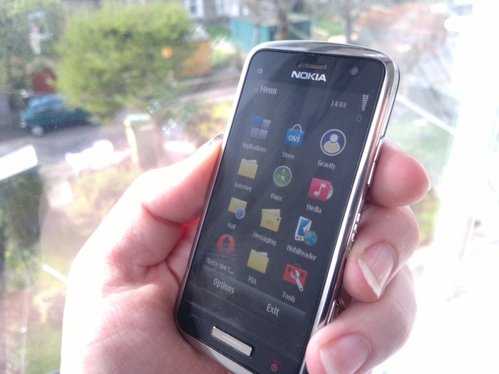
The other part of the screen that really makes the C6 is that even in this 3.2 inch display, it retains the nHD dimensions of 640x360. That makes for an incredibly tight pixel density, especially when you put it next to the E7. I'm a big fan of getting as much information on a screen as possible, and in previous Nokia phones with the smaller screen, the underlying font was increased in size – you ended up with the same “real life” size as a larger screen but with less information. Not on the C6 – here you get the same font sizes as the other Symbian^3 devices, and that means exactly the same amount of information can be put on display. It might be psychological, but because of this, the C6 feels like it is packed with the information that I need.
The small screen also makes it faster to use, because every part of the C6 screen is reachable by my thumb when the device is in my hand. There's no requirement to use the index finger on my other hand to navigate the screen. It's something of a necessity on the E7 and generally the way forward on the N8, but the C6 is, genuinely, a one handed device, and the only Symbian^3 device with this potential (at least in my hand!)
With all the ports at the base of the C6, the headphone socket feels like it's in the wrong place, and if you spend a lot of time with the phone in your hand it can get in the way, but it does mean it sits in the pocket the right way up to be pulled out so that the top of the phone is in the top of your hand. A small, but practical, side benefit. And if you're up for some audio, the mono speaker is best in class. Somewhat surprisingly, it comfortably outperforms all the other Symbian^3 devices in terms of loudness and clarity - at least in part a byproduct of a decent sized speaker grill with multiple 'gaps', compared to the minimalist single line gaps on the N8 and E7.
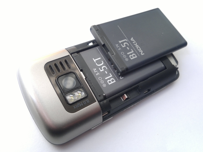
There is one issue with the C6 that's not immediately apparent, and that's battery life. In “regular” day to day use, checking emails, random web browsing and social networking, the C6 holds up to a full day of use, but when you move from “connected businessman” to “connected web 2.0 person” the 1050 mAh battery needs a bit of a top up in the evening to make sure it won't run out. There's no shame in that, something had to give to get the size down on the C6, but in the trade off between battery size and the curve on the back of the device, I think Nokia have gone just a little too far – making the back of the C6 a little bit more angular would have provided a touch more internal volume and potentially get a 1320 mAh battery in there (like the BL-5J the 5800 carries).
Up until the start of March, the C6 was my constant companion, it was “the phone” and I was supremely happy about it. To be honest, I still am – but something came along that pushed the C6 back to “the super duper reserve phone.”So if I love this phone so much, why have I switched the day to day SIM card out of the C6 and into the E7?
To be honest there is very little in it. Part of the reason is that the two weeks at SXSW where I used the E7 as the main device (with a US SIM) and the C6 tucked away in my Sporran for those calling my UK number meant that the E7 was literally forced into my hand while I was being very creative.
There's no doubt that the C6 is not best suited to the creation of media and content – while the camera covers a lot of my mistakes (trust me, getting to “slightly above average” in the picture taking stakes is something that should be cherished), the smaller screen means that text input beyond a status update, SMS or super short email becomes a little trickier. While the software underneath the two devices (and indeed the N8 and C7) is as close as they can be, given the targeting of each device, the physical size of each device and how this affects the user interaction is the key differentiator.
Given that, the C6 is much more a device for consuming content and commenting on it, while the larger E7 with its smooth keyboard and 4” screen is clearly geared towards creating content.
To me the C6 is still the phone of choice in a huge number of situations, it's just that on those few occasions where I need to do some work away from home, to sit down and write out some articles, blog posts or deal with a bulk of email while travelling, the E7's keyboard suddenly wins out. That “just in case” is enough to make me carry the E7. To be fair to the C6, that's about the only issue that has made me swing away from it – the brutishness of the N8 never had enough of an appeal for me, and the fashion concious C7 looked great, but I was never one for fashion.
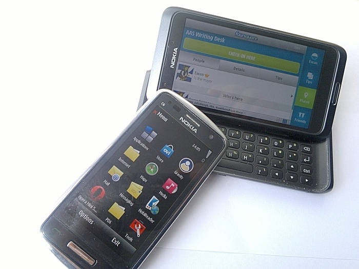
What the E7 has done though is re-emphasised just how cute, how gorgeous and how wonderful the C6-01 actually is. This is a tiny package of a phone. But it's very appealing; the styling, especially on the metal back cover and the bezel around the screen, still looks fantastic; the physical buttons on the right hand edge are all accessible in the hand and my thumb can hit every part of the screen; the home button and the honest to goodness real call and end buttons; the software does everything that I need it to do...
While it's not quite “disposable”, the C6 is a veritable Swiss Army Knife of a smartphone. It's small and discrete, but when you really need to chop down a tree (or anything else) then it's there for you, ready to go to work. That it can do this is not in the least bit shocking to the rational part of my brain, but it still surprises the rest of me every time it happens. You expect the E7 to do all the things it does – you expect the C6 to answer a call and not much else.
The C6 is the closest thing in the Symbian world to a magical device, though there are going to be people who want a bigger phone, with all the specification numbers higher than anything else. Neither is it going to lead the marketing war as the hero device. The C6 is the dependable, smart one in the corner that you expect very little from, but in the end holds the answer to the questions you need answered.
Yes, after all this time, the surprising truth is out. The C6 is the Hermione Granger of Symbian.
-- Ewan Spence, April 2011.
Reviewed by Ewan Spence at
