Review: DreamLife - The Life Information Manager?
Score:
89%
Version Reviewed: 1.10
Buy Link | Download / Information Link
The need for a better Calendar application on UIQ 3 can be justified by the availability of 2 alternatives, namely AquaCalendar and Agendus. Both are highly capable applications and packed with features. However, the boys who brought us DreamConnect felt the holes were not quite filled yet. The problem with these third party calendar replacements is the design. Look at Agendus for UIQ 3, for example. It was ported from the UIQ 2 version with no effort from the developer to improve on the design and follow UIQ 3 design philosophy.
The DreamSpring Team, led by Malcolm Lithgow, now offers us DreamLife, a solution offering not only calendar and todo replacements, but contact management as well, in line with their philosophy in providing a complete solution for Life Information Management instead of Personal Information Management.
Activity View
Basically, DreamLife has 2 main functions, the Activity (Calendar) View and the Contact View. Although DreamLife comes in a single SIS file, it yields 2 application icons. One for DreamLife (Activity View) and another icon for DreamLife Contacts (Contacts View). Useful for launching the desired app directly.
In the built-in calendar, there are 3 different panes or views: Monthly, Weekly and Daily. In DreamLife, it's all different - instead of dividing your calendar data into different views with different layouts, it presents the calendar database in vertical blocks with date/day indicators on the top and time indicators on the left. And all views are standardised. Have a look at the difference between the built-in UIQ 3 Calendar day view and DreamLife’s 1 day view. 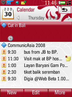
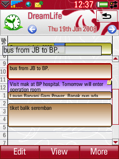
Built in UIQ 3 Day view vs DreamLife’s 1 Day View, complete with colours and summary popup.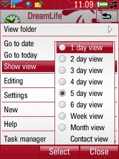
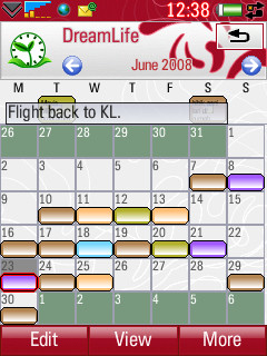
You can select from 8 different views in the Activity View, ranging from a single day to multiple days and also a week and month view. Entries are grouped into categories, which can be configured to display colours. For usability, this is a welcome enhancement over the plain and dull built-in Calendar view. 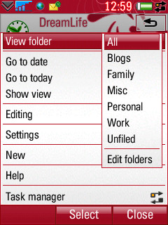
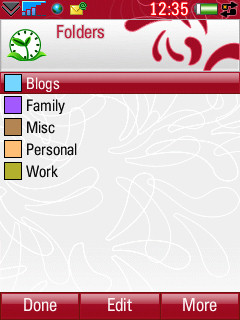
Categories and the edit screen
Another thing worth noting is that Task/Todo and All Day items are integrated together. They are located at the top of the screen to differentiate them from the other entries. Meaning you don't have to open different apps to manage them. And in terms of utilising the limited screen real estate, there’s also a shortcut to access most used functions by tapping the application icon on the top left (also available in the Contact View). Unusual, but useful!![]()
![]()
The shortcut menu, easy access to most used functions
Calendar entries can be displayed in various ways. By default, they will displayed as pop-ups when you scroll (using the jog-dial) from one day to another. There are two types of details pop-up, SUMMARY and DETAILS. The summary details pop-up is displayed on top of the screen and when you press the View softkey, another popup is displayed at the bottom of the page including the note of the entry (if any). I found this very useful because it is fast and I don’t have to click on each day to display an entry’s information. 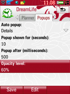
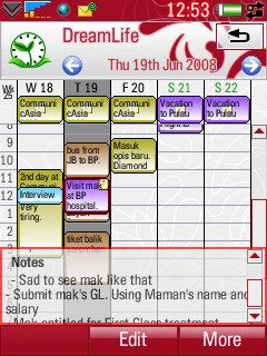
The popup setting and entry details pop-up at the bottom
And those who fancy a 'fullscreen' view can activate it from the menu or from the icon menu but it’s not really full screen, only the softkeys at the bottom are hidden and the icon bar at the top is still displayed. I think the developer should implement a proper full screen view (also in Contact View) - witness Kylom’s Projekt, where the softkeys, icon bar and status bar are all hidden.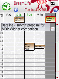
Full screen or not?
The Special Editor
The one of a kind appointment manager gets more interesting with this editor. To separate itself from the herd, DreamLife's editing screen is divided into several parts. Most obvious is the dual pane window, where you can see the time of the day on the left, which is useful to see which timeslot of the day is empty. And there are also 4 tabs to better organise details of the calendar entries. This is another function that should prove useful because, sometimes, you might want to ignore all the details of an appointment if you are in a hurry but, most of the time, you can spend a little bit longer to insert the location and the attendees and some note, perhaps.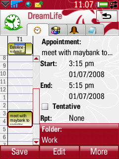
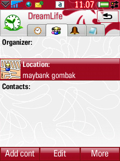
The editing screen, and one of the 4 tabs
It is also possible to add contact details in a calendar entry, and not only one, but multiple contacts, can be linked to one appointment. The entry dialog is very well laid out, with options to select a contact as attendee or organiser, which is useful if you always organise meetings and require attendance from multiple persons.
![]()
![]()
Multiple contacts can be linked to any appointments
Contacts View
Actually, the Contact View in DreamLife is exactly the same application as DreamConnect3. I will not talk about its functions and performance again because I have reviewed it here. The developers have really put a lot of effort and time in integrating the contact and calendar databases because you can link contacts to calendar entries in DreamLife with ease. In Contact View, whenever you want to associate a contact with a calendar entry, you can do it easily. By highlighting the desired contact and pressing More - Create Activity, and you'll be prompted to enter the details of the activity. You can also link an appointment with a contact from the Calendar View.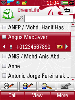
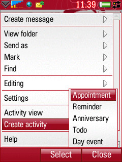
The Contact View, aka DreamConnect3
Conclusion
From the speed in opening contacts, to the stability and versatiity, I have no complaints, because in my opinion DreamLife successfully captures the essence of making a useful mobile application. It is truly an indespensible application for all UIQ 3 smartphones.
(It also reminds me a lot of an ancient Psion application called BusyView, which was one of my favourite ER5 applications aeons ago ☺)
From my experience testing and using DreamLife every day for a few months, I can say that it really has enhanced my life’s management, especially when I have multiple appointments in a day. And for someone who relies on synching over the air to Exchange Server through MS ActiveSync, I have found no problem with DreamLife and its integration with all my contacts and calendar databases (I don’t sync todos and notes).
PS. Regarding the future of the application after the announcement of Symbian Foundation, here's what Malcolm Lithgow has to say :
"We're still evaluating exactly how the SymbianFoundation changes relate to us, but we've already started porting to S60. My current thoughts are that we'll tidy up any issues with UIQ 3, and add any easy-to-program features that "round out" the product without too much effort (E.g. cut-and-paste.) There's some work that we're in the middle of, which makes sense to finish in UIQ 3, since the code will be shared with S60, and that will make it into UIQ 3 as well. The plans we had for adding textual list views to the UIQ 3 product will probably have to be shelved, unfortunately. I was looking forward to that.
However, our main focus is obviously going to have to be on the S60 base.
I'm a little sad about this, because I think UIQ is the better UI, both from a user's and programmer's perspective. However, having a unified UI is definitely better in the long run. I just hope UIQ 3's listbox and building block framework make it into the unified OS.
Having access to the source code will be great for developers like us, too. Can't wait for that..."
The only downer, at least for me, is the steep price, at Euro 42.95 (around $68.00) - but if you really need a superb LIM app with no compromises, it's still worth the money (cause it's 2 applications in one!).
Asri al-Baker July 7th 2008
Reviewed by Asri al-Baker at
