Review: Nokia N73
Score:
82%
You really can't accuse Nokia of failing to differentiate their range of S60 3rd Edition devices - each one has been wildly different from the rest, at least to the trained eye. The N73 has been widely touted as a natural successor to the best-selling S60 2nd Edition-powered N70, but that's only really half the story.

The truth about the N73 is that it's all about the camera. And what a camera, 3.2 megapixels with greater clarity, far less compression artefacts and better colour than even Nokia's own flagship N93. Where the N70 was perhaps 70% smartphone and 30% camera, the Nokia N73 is a true half and half. With such a strong imaging focus, it won't appeal to the 'why do I need a camera in my phone' brigade, but I doubt Nokia will mind.
In truth, the N73 is less than perfect as a smartphone, as you'll see below, but for the target market the photos it takes will more than make up for this. But let's start with a little proof:


(click each thumbnail to see the full size image and watch for your browser trying to resize. Best of all, right-click and choose 'Save target as')
In the first photo, zoom in on the trickles of water at the base of the ball and prepare to be impressed. As Rafe commented to me a moment ago, with quality like this there really is no point whatsoever in taking a separate digital camera with you, for daytime work, at least.
The N73's camera has the obligatory Carl Zeiss optics, a mechanical shutter and a good autofocus lens, though not with optical zoom (as on the N93). And, in case you were wondering, video capture is at the Nseries 'standard' of 352 by 288 pixels and 15 frames per second, OK for casual clips of family and friends but ultimately blocky. So if you buy the N73, it's going to be for the stills capability.
It's worth noting that, as alluded to above, camera performance in dim conditions is less than stellar, as with virtually all phone-based cameras - there simply isn't enough light to produce good results on such a small CMOS sensor. Still, the N73 is no worse than other similar cameras and in fact I was quite impressed with results in pitch black conditions using the built-in LED flash, which is used both for auto-focussing and taking the actual picture.
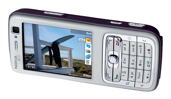
But we're getting ahead of ourselves. The N73 is a successor to the N70 in terms of form factor and looks, at least, with an almost identical form factor, size and key layout. It's light at 116g. There are lots of detailed differences though, many of which aren't necessarily positive, so bear with me while I talk you round the hardware.
The most obvious difference is the screen. It's a full 2.4" diagonal, the same fabulous display as in the N93 but thankfully this time not waving around on the end of two swivel joints. Resolution is 240 by 320, a definite improvement from the old 176 by 208 pixel standard, even though fonts do still look a little blocky on the large screen.
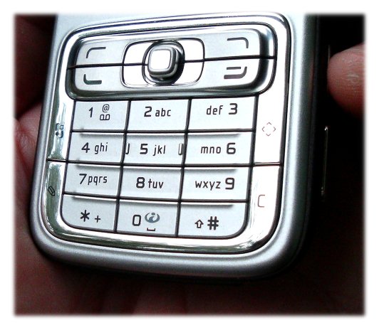
Away from the screen things are not quite so rosy. The overall construction of the N73 screams 'plastic' at the top of its lungs. The silvery keypad feels cheap, with a horrible ridged top to each numeric key and a joystick and surround that look as if they belong in your local 'pound' shop. Squeeze in the side of the N73 and you'll feel a distinct flexing, with an accompanying ghastly creaking noise. And to keep this noise company there's a rattle from the camera slider on the rear of the phone, which doesn't seem to have been made of sturdy enough plastic.

Below the keypad is the miniSD slot, hidden behind a very close fitting door. The manual says to use a fingernail to open it, but in my case I had to resort to a jeweller's screwdriver and a few scary moments in order to get at the card slot. Admittedly, few of us change cards very often, but I can't see why so great lengths are taken to protect the card slot when the just-as-vulnerable Pop Port and power socket are completely exposed a couple of millimetres below.

On top and bottom of the phone are cosmetic 'grilles', hiding both stereo speakers and microphone. Maybe it's just me or maybe these are supposed to be 'retro' but I found them unattractive.

The right hand side of the N73 is devoted to buttons. Several of them. At the top is a rocker switch, marked with a zoom icon and designed for zooming in and out in the camera and in displayed Gallery images. It also, sensibly works in telephony, for changing volume, and with the same function in the Music Player and RealPlayer.
At the bottom is the main camera shutter button, in the same location as the 'alternative' shutter on the N70. This works well, in conjunction with the camera interface, working exclusively in 'landscape' mode. So far so good.

The middle button is for 'Review', i.e. Gallery>Images and Videos under an assumed name. Now, while I applaud the extra hardware shortcut to an application that's going to be heavily used in such a device, there's a problem. Unlike the zoom and shutter buttons, which you can press by accident 99% of the time without incident (with the camera shutter closed), the Gallery button launches or switches to the application, as designed, which in normal candy bar/portrait mode is almost certainly not what you want to happen when you simply pick up your phone. Here's hoping that this button also gets locked out with the shutter closed in an upcoming firmware update.
Nokia have been rather clever with the way Gallery has been implemented on the N73. It's actually impossible to 'Exit' it, with the application merely being sent to the background. I'm pretty sure this is to speed up thumbnail creation. With images at 3.2 megapixels and over 1MB each, it takes 20 seconds or so at least, for each thumbnail to be built, so by arranging for Gallery to chug along in the background, the processor time can usually be sneaked in between whatever else you're doing, so that when you next press the button, up pop the thumbnails, all ready for viewing.


There's a new, advanced 'slideshow' mode here, with the option to automatically 'pan and zoom' around your images during playback. It's a gimmick though, because the photos shimmer and wobble as they change on the small LCD display. There are a variety of photo editing effects, as on the N93, but each of them is also pretty limited and back in the real world, you're going to be doing more serious things with your images on your desktop. The most you'll be doing on the smartphone itself is using the 'Web upload' facility to send original or downsampled images to an image service such as Flikr (the only one with shortcuts built-in here).
At least all three buttons light up when the camera slide is opened, a nice touch. Indentations on the slide help you open it one-handed, after which you're well and truly in landscape mode, with the N73 held like a traditional digital camera. Held in two hands like this, the top buttons are in just the right places and the new Camera application, as debuted on the N93, is now streamlined and well implemented. Switching between image/video modes is now the default action on the navigator and shown on the strip of pop-up icons overlaid on your camera image.

Just as on the N70, there's a good LED flash system, with it activated during focussing and during actual image capture. And, just on the N70, I'm sure a utility will be along shortly letting you keep the LED on to use the N73 as a torch.
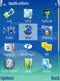
Back in portrait/smartphone mode, there are less innovations, though this is still a very solid multimedia smartphone. It's S60 3rd Edition, of course, and Nokia have continued the trend of fiddling with the placement of application icons in every single device. Whether this is simply because they believe different devices need different application emphasis or whether they simply aren't happy with the 'mix' yet, I couldn't say. But at least some thought is going into the initial user experience, with the first six icons being Contacts, Messaging, Calendar, Music, Gallery and Games - pretty much what the newcomer would want to try first. Below these are three Internet shortcuts (Search, Services and Download!), with three folders endnig out the '12' and providing homes for the majority of the S60 mini-apps. All pretty logical, though I really hope Nokia standardise on a layout sometime soon. Maybe this one is 'it'.


In use, the N73 isn't particularly speedy, but it isn't slow either. Any experienced S60 user will feel very quickly at home. The design choice of the joystick won't be too everyone's tastes though and some games, in particular, will suffer - the N70's navigator key was far, far faster for game use.
After booting, the N73 follows the S60 3rd Edition trend so far by having just over 20MB of RAM free, although doing anything that involves landscape mode (e.g. starting Camera or Gallery) will knock 4MB off this immediately. So, the usual multi-tasking caveats apply with regards to the really heavy RAM-hungry applications, such as Opera Mini, Web or a sat-nav solution.
In terms of connectivity, there's infrared and Bluetooth but no Wi-Fi, another differentiator from the N93. Not that I missed it, normal GPRS/3G data seemed to work just fine. And the N73 is quad-band, so the one model should work more or less anywhere in the world, which is good to see.
This being an Nseries device, there's Media Player 10 integration and WMA file support, along with stereo audio output. Music quality didn't seem as crisp as on other Nseries devices though, despite me fiddling with the built-in 'Equaliser' and the maximum volume of playback was only just sufficient in a quiet office - I sincerely doubt that the N73 could currently power music playback in a noisy environment such as a train station or on a bus. Visual Radio is also here, though why they persist with this rather than simply calling it 'Radio', I really don't know.
It's a fairly standard Nseries software bundle, with the viewer component of Quickoffice and Adobe's PDF reader. There's also Yahoo Go!, if you're a big Yahoo fan, though watch your data useage and battery life if you do use the application. There's also a completely pointless application shortcut to F-Secure's Anti-Virus, included presumably to do a favour to their fellow countrymen - guys, you're saying 'Hey, we've got a new OS and it's fabulously secure' but then also saying 'Err... better check out some anti-virus, just in case'. There's a mixed message here that could do with resolving.
I've been through something of a roller-coaster ride with the N73. My first impressions were awful, with the over-plastic feel and noisy case, plus tacky joystick and number keypad. But then I was completely bowled over by the stills camera and the pendulum swung in the other direction.
The N73 may yet be an adequate successor to the N70, provided the Gallery activation key problem is fixed in firmware and provided a little more attention is paid to hardware quality control back at Nokia's manufacturing plant. Other niggles, such as the low volume of the built-in Music player may have to be solved in a component change for future manufactured devices.
With the way firmware updates can significantly improve the performance and functionality of a device, especially in these days of DIY updating, it's tricky to give a one-off verdict. The N73 certainly has potential, and the form factor and general camera capabilities are extremely impressive.
Steve Litchfield, 4th September 2006
Second opinion: Stuart Clark
Keyboard - Having used the N73 daily for over a month now, I disagree with Steve and find the keypad design very good - the raised edges to the keys make it very easy to use the keypad without looking, especially useful when typing text messages quickly. Compared to the N70, the N73's keypad is a delight to use - if like me your fingers always used to slip off the keys on the N70, or make the keys rock in an annoying fashion, you won't have any such problems with the N73.
The joystick is, in my opinion, also very easy to use. Occasionally it could be said to be too sensitive, but this is something which you quickly get used to. After a couple of weeks use, I very rarely mis-navigate when using the joystick.
Build quality - I've heard many stories of people finding the N73 a bit "plasticky" - this seems to be very much on a phone by phone basis as my N73 has not exhibitied any such problems, If squeezed very hard just above the camera shutter button, then yes, the phone does creak slightly, but no more than my N70 did when squeezed in a similar fashion.
 Usage and memory leaks - The current firmware has a few problems with memory leaks, and displays a couple of annoying, but not critical, bugs. As Steve mentioned, it is physically impossible to exit the Gallery application, although I disagree with Steve and believe this to be more of a bug than by design. Camera, Logs and Calendar also exhibit the same behaviour at various times. These applications not exiting result in the amount of free RAM dropping significantly when in general use, to the extent that with only 7BM free RAM, when trying to zoom a picture in Gallery, a "Not enough memory" error is received.
Camera - While the camera is much better than the N70, the focus on the N73 is a little on the "soft" side for my liking - a condition which seems common amongst Nokia phones. While the camera is arguably not as good as the one on the Sony Ericsson K800i, the N73 is definitely the best camera of the current Nokia phones.
Applications - Obviously there aren't yet as many S60 3rd Edition applications available as there are for the older N70, but this situation is rapidly changing. However, one small problem exists when using Java applications - a lot of Java apps are not correctly re-sized (zoomed) to fit the entire screen estate of the N73 (wasn't screen scaling meant to be a feature of S60 3rd Edition for older Java apps?), sometimes resulting in a confusing mess being drawn on screen as the application attempts to use just a subset of the N73's screen.
Stuart Clark
Reviewed by Steve Litchfield at
