Review: Long term review: Nokia E55
In this first part of a two part long term review, David Gilson looks at the hardware on his trusty Nokia E55, at his side now for eight months. From design to materials to typing to camera, David covers the E55 in detail. Part two will follow later in the week and will both look at the E55's software and also draw some long term conclusions for this diminutive qwerty smartphone.
Version Reviewed: 34.0001
Introduction
The E55 and E52 are still Nokia's latest candybar style Eseries offerings, and have been available to buy SIM-free since September 2009. Both Rafe & Steve took a look at the E55 when it launched (also see Rafe's video review). I bought my own E55 as soon as they were available, and have been using it heavily for most of that time. So after eight months on the market and three firmware updates, the E55 is still my trusty companion ready to take on whatever I throw at it. However, that is not to say there are not rants to be had about decisions by Nokia that relate to the E55. Therefore, I hope that prospective buyers (and Nokia product managers!) will find this review of particular interest.
Hardware
Physical Features
Looking over the basic specifications, the E55 offers the following selling points in a body that is 48mm wide, 117mm long and a mere 10mm thick, with a feather-weight mass of 98 grams:
- 2.4" 240x320 (QVGA) transflective LCD screen
- Powered by the 1500mAh BP-4L battery
- 120MB RAM
- 60MB C: drive
- 3.2 megapixel Extended Depth of Field (EDoF) camera with LED Flash
- Quad band GSM, GPRS, & HSPDA ("3.5G").
- Bluetooth 2.0
- Wireless LAN 802.11b & 802.11g
- FM Receiver
- Assisted GPS & Digital Compass
- Accelerometer
- USB 2.0
- 3.5mm headphone socket
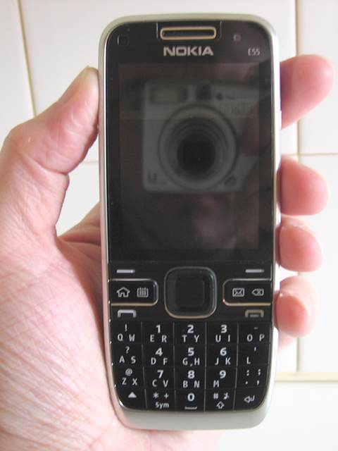
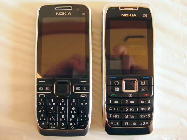
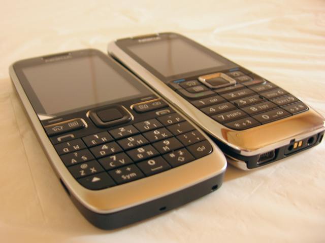
The design of the E55 can been seen as an evolution of previous Eseries candy bar phones. Comparing it to the E51, we can see that while the thickness and volume have decreased , Nokia have maximised the front area, allowing for a larger screen.
Design
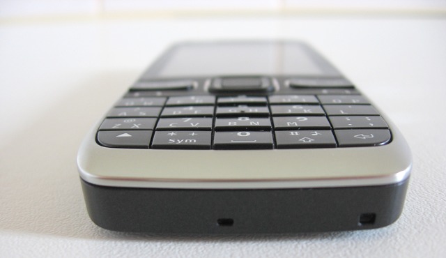
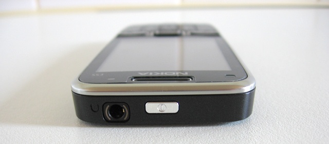
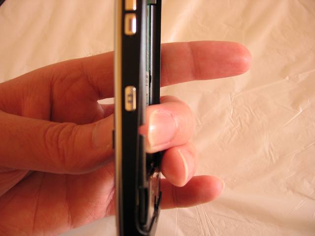
Overall, the E55 has a very clean design with very little in the way of surface breaks. The right side has four buttons: the dedicated camera button, along with the volume keys, which flank an extra button that triggers voice control mode. I would have liked the voice control button to be reprogrammable, but it does act as a mute button during calls. The left side is blank, apart from an inconspicuous Micro USB socket for data and charging. The base just has two small holes, one for the microphone and one for attaching a lanyard. The top has a small power button and a 3.5mm headphone socket. After eight months of regular use, the power key has yet to fail, but has developed a disconcerting tilt when pressed off-centre.


Compared to the E51, the E55's lack of coloured call and soft keys serves to give an understated look. It thus wouldn't look out of place slipping into the pocket of a pinstripe suit, as befitting its Eseries classification.
Protruding between the soft key and call key rows are the shortcut keys. These are four buttons made to look like two, thanks to see-saw like covers. The first see-saw button consists of the 'Home' key and the Calendar button, the second has the E-mail/Messaging and Delete key. The first three of these have dual functions for long and short presses. The 'Home' key is set to having a short press sending you to the home screen, and a long press launches the application switcher. By default, a short press of the Calendar or E-mail keys launches their respective applications, and a long press respectively creates a new calendar item or e-mail; but these four inputs are reprogrammable. There are less shortcut keys here than on the older E51, but it doesn't take long to appreciate having less button assignments to remember!
The D-pad and battery cover are made of coloured anodised Aluminium; clearly a test case for future phones, such as the N8. This is far more durable than coated plastic, e.g. as found on the E51 D-pad. In contrast, the E55's D-pad doesn't look at all tarnished after 8 months of use.
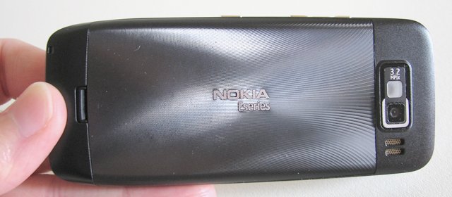
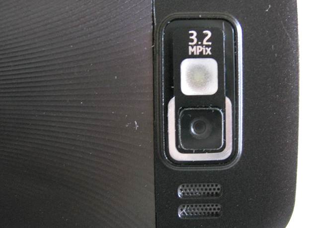
The back of the E55 is equally blank. Most of the space is taken up by the textured Aluminium battery cover, which is also anodised and coloured. Above the battery cover is a plastic housing for the EDoF camera and loud speaker. Albeit mono, the E55's speaker is great. It has a surprisingly good bass response, and is loud enough to fill a small room.
Battery
The E55 runs on Nokia's massive BP-4L battery. With the E55, my tests have shown that it will last for a full 24 hours under heavy usage, up to 56 hours with moderate usage, and around 3 days on very light usage. It's a refreshing change to be thinking about battery life in terms of days, rather than hours! Removing the battery shows just how tightly packed the E55's technology is.
Screen
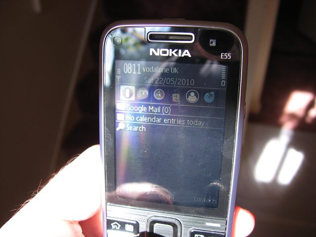
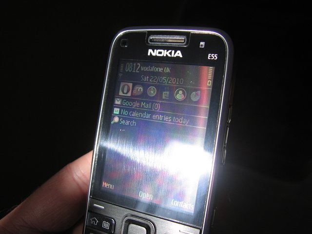
The E55's 2.4" QVGA screen is transflective, a technology which has been discussed many times on All About Symbian, although the benefit bears repeating. A disadvantage of touch screen phones is poor visibility while outdoors. However, with the non-touch E55, and similarly equipped Eseries phones, you will always be able to read the screen, whatever the conditions. The photos below were taken with sunlight directly on the E55's screen.
Half-QWERTY Keyboard
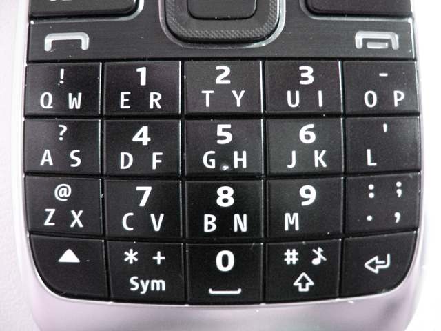
The most notable physical feature of the E55 is of course its 20-button "Half QWERTY" keyboard. This is a novelty for Nokia, but it has already been done with the Blackberry Pearl range. The keyboard design should not be confused with Sony Ericsson's M600i and P1i, with which letters were accessed by physically pressing either side of each key. Instead, typing with the E55 is achieved by either predictive text, or multi-tap.
Overall, typing on the E55 works well. I had early hopes that it would be possible to type faster than with 12-button T9 keypads. However, when using predictive text, with one or two thumbs, in practised hands the E51's T9 style keyboard can achieve as many words per minute. However, while it seems that predictive text typing on the E55 is no faster than a T9 phone, typing is more comfortable.
When the E55 was first released, there were complaints about typing punctuation marks. Unfortunately, after three firmware updates, this hasn't changed. Each key has letters printed along the bottom, and a symbol or number printed on the top, which is accessed via the symbol-shift key (bottom left). The symbol menu key ("Sym") has "*" and "+" as its extra symbols. Those symbols are typed by pressing the symbol-shift key followed by one or two presses on "Sym". However, the full stop key has four symbols but does not behave in the same multi-tap manner. Instead, whether in predictive or multi-tap mode, the user has to cycle through each character until the desired one is found. This is a speed bump to typing, and the inconsistent behaviour is a significant barrier to learning to type on the E55.
Camera
The E55 uses a 3.2 megapixel Extended Depth of Field (EDoF) camera, instead of an auto-focus or fixed-focus lens. This is a new technology for mobile phones, but judging by the next generation of S60 phones (e.g. the E5) Nokia looks set to replace traditional fixed focus camera modules with this. Steve has already explained how EDoF works, but I'll summarise it here for reference. The camera (effectively) has three (slightly different) fixed focal points for red, green, and blue light. Once the image data is read from the sensor, the software breaks the image up into sections and judges which colour delivered the sharpest image for each section. It then uses that colour data to define the image segment, and data from the remaining two colours to provide colouration. By performing this process on small segments across the whole image, it is possible to have both background and foreground objects in focus at the same time, from a metre away to infinity.
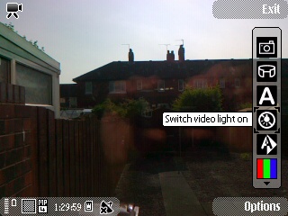
There is a single LED flash with the E55's camera and while it's better than nothing, even dual LEDs don't cut it in low light conditions. What's more, there's no torch feature (as on the E63)! (If you want to use the LED as a torch, you end up having to record a Blair Witch style video!)
The camera's user interface has two main elements. First is a status bar showing remaining battery life, remaining memory card capacity and GPS status (for geo-tagging). The other element is a vertical toolbar along the right. The still image mode has so many image adjustment tools, you have the option of customising the toolbar to show as many, or as few, items as you want.
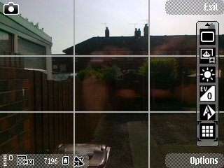
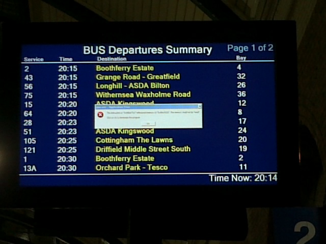
Using the still image adjustments wisely can yield impressive results. For example, in the image below, the contrast difference between the night-time surroundings and bright screen was washing out all of the detail in the error box I wanted to photograph. Adjusting the exposure compensation allowed me to properly capture the black on grey text.
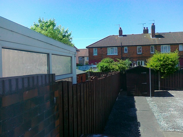
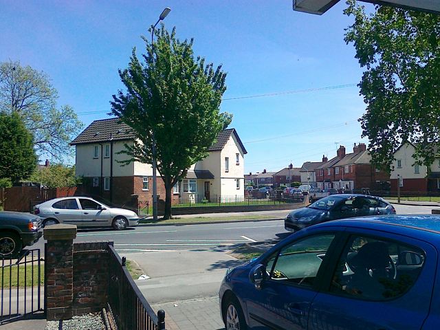
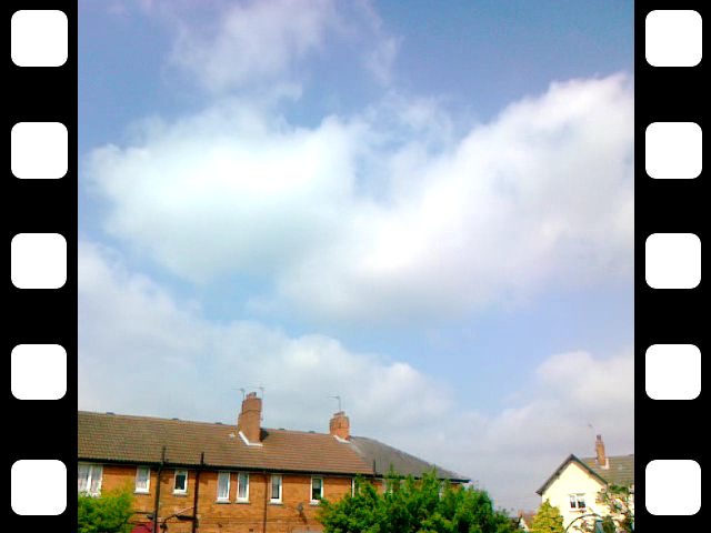
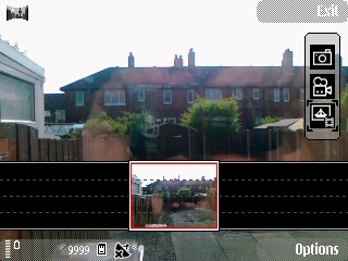
In addition to video and still mode, the E55 has a panoramic mode, with a helpful user interface for lining up each shot. Here's an example of what you can achieve, and a demonstration of near and far focus:
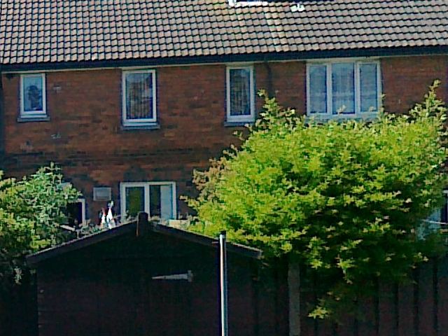
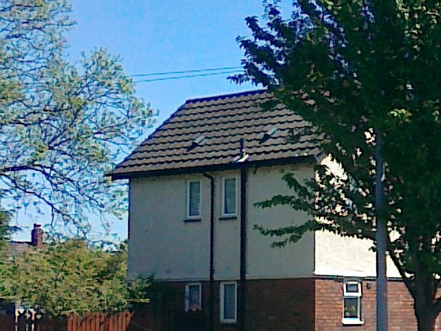
The EDoF technology can achieve surprisingly good results. However, because it relies so heavily on image processing, some fine detail can look a little over-processed. You can judge for yourself with the two examples below: each image has been scaled down (but is a link to the original image) and then followed by a 1:1 scale cropped section of the same image.
Example One.
Example Two.
Video capture on the E55 isn't spectacular, but measuring 640x480 pixels at 15 frames per second, it will do for the likes of YouTube.
Click here to view a 4.8MB MP4 sample video from the E55.
In the second part of this revisiting of the Nokia E55, I'll be looking at its software package and how this has helped or hindered me over the last eight months.
David Gilson for All About Symbian, 25th May 2010
Reviewed by David Gilson at


