Review: Sony Ericsson M600i
Score:
85%
 Design
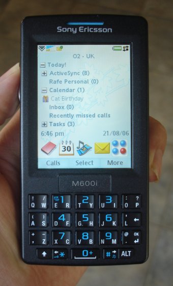
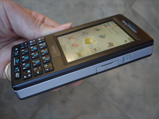
The M600i has an understated elegance in its simple block form factor (which it shares with the W950). Angular edges are offset by rounded edges and the overall impression is one of compact solidity. The M600 is available in black or white. Both colours have cyan highlights set into the casing, stylus and keyboard lettering. For a business-focussed device it's stylish and in common with many other Sony Ericsson devices its looks should draw attention.
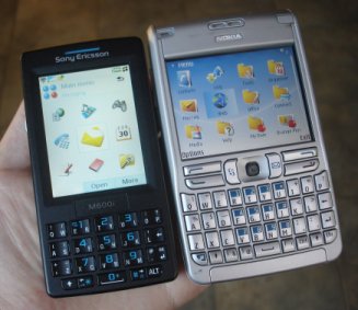
At 107mm x 55mm x 16mm the M600 is smaller than many of its competitors and is far nearer the tradition phone monoblock form factor than other thumb keyboard-equipped devices. When compared to an E61, Treo or Blackberry the difference in width is noticeable. As a result the M600 feel much more comfortable in the hand when used as a telephone and, weighing in at 112g, further reiterates the idea that the M600 is a much more pocketable device.
The relative thinness of the phone impresses too, because although it is a matter of only a few mm of difference, proportionally the difference is quite significant when compared to other smartphones. The M600 is thin for a phone and even thinner for a smartphone.
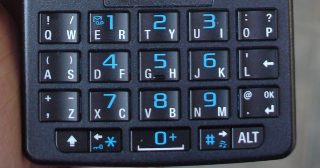
The front of the phone is dominated by the keyboard and the large QVGA, 262,000 colours TFT touchscreen. The keyboard is a cross between a traditional number keypad and a full QWERTY keyboard. Instead of the usual single letter per key, the M600 has keys with split personalities. Each key is concave (each edge is raised up slightly) and each edge (left and right) can be clicked individually. Consequentially each key has two letters on it (A and S, E and R, T and Y and so on). As a result, fewer keys are needed to cover the alphabet and each key can be bigger. In effect two smaller keys have be merged together to make one larger key with the resulting key being able to be pressed down in two separate ways either side of a pivot.
The central 9 keys operate as a normal number keypad in certain situations. In these cases the keys can be pressed down on one edge or in the centre of the key to get the appropriate number. In full QWERTY mode the numbers can be accessed via the ALT key which also gives access to the secondary elements such as punctuation. The shift key operates similarly to give capital letters.
The bottom row of the keyboard has five keys, including the ALT and SHIFT keys on each end, one key in from these are the left and right arrow keys (also doubling as the star and hash keys on the number keypad). These are used to give left and right control at various points in the UI, such as navigating between tabs or moving through the list of potential predicted words when entering text. The arrow keys, together with the scroll wheel, back button and the finger-operated on-screen softkeys are all that is needed to navigate around the phone's functions. This one handed usage works well, although it is hampered by the need to switch the thumb between the various buttons which are (physically) some distance apart.
The end result is surprisingly effective and, although not as quick as full key variants, it is a good compromise in view of the space the keyboard occupies. Furthermore the onboard word prediction software, licensed from the Zi Corporation, makes the most of the keyboard and helps increase the speed of text entry.
I found in testing that the M600 keyboard was not as quick as the E61 or other 'pure' thumb keyboards, but the difference is small, and after an initial learning period anyone should be able to achieve acceptable results. As with other thumb keyboards, those with larger fingers may have problems, although the M600 will probably be less problematic than others because of the generously sized keys.
If you do not like such keyboards or plan to do a large amount of text entry then the M600 may not be suitable, but for short message replies and limited data entry the keyboard is more than adequate. It is worth noting that the M600 also supports input via handwriting recognition (good) and an on-screen keyboard (poor), although these are best seen as secondary options.
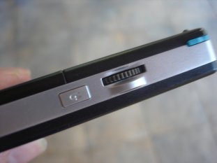
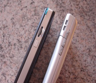
On the left hand side of the device there is a three-way scroll wheel (up, down and in) and the back key. These are used to navigate through the phone's user interface, and the majority of functions can be accessed using these. The basic principle is that the scroll wheel is used to highlight and then select items from a list while the back button is used to go back to the previous level. On Sony Ericsson UIQ 2 phones this functionality was assigned to the five-way scroll wheel, and the separate back button on the M600, although less confusing initially, feels like a backward step. In order to use the back button you have to take your thumb off the scroll wheel which adds time and may be fiddly for those with less nimble fingers.
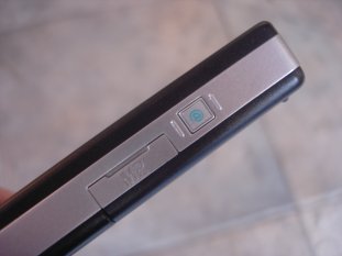
The top of the device has the stylus slot, an infrared window and the power button. On the right hand side is the one customisable hardware button. By default this launches the Web browser but this can be changed to other actions in the settings. Unfortunately the hardware button is a little small and this somewhat limits its usefulness. Immediately below the hardware button is the access for the M2 memory card slot. This is hot swappable and provides memory extension options. The M600 ships with a 64MB card which, in contrast to the respectable 50MB of internal memory, is of limited use. If you plan to take advantage of the multimedia capabilities of the device you will need to invest in a bigger card. The bottom of the device has the connector port for power and USB connections.
UI Concepts
The M600i is the first device available on the market using UIQ 3, which is the first major public revision of the UIQ interface. UIQ 2 was a pen based/touchscreen user interface used by Sony Ericsson, Motorola and BenQ and aimed at high end smartphone devices. By contrast UIQ 3 can be used by both touchscreen (pen) and non-touchscreen (keyboard) based devices.
In the move from 2 to 3 there have been a huge number of changes, and many of the UI paradigms in UIQ have been radically overhauled. We will be looking into some of these changes in later articles. What really matters to the average user is that UIQ 3 is now a lot more flexible, supports more features and can be run on a greater variety of device types.
In contrast to UIQ 2 (which was something of a 'one trick pony'), UIQ 3 is now an important part of Sony Ericsson strategic plans. Other UIQ 3 devices that have already been announced are the P990 and W950 and it is likely that there are more on the way. This is good news for users as it should be possible to transfer between devices with similar operation and because it should encourage the development of compatible third party software and services.
While Sony Ericsson are not, yet, committing to UIQ 3 to quite the same extent that Nokia has with S60, it is set to become a major platform for them. In essence, Sony Ericsson's platform strategy is based on two major elements - a standardised Java platform for all devices and secondly UIQ 3 as a platform for mid to high end devices. Therefore the M600 is something of a watershed for Sony Ericsson and very much looks to the future.
UIQ 3 comes in three flavours: SoftkeyStyle (non touchscreen, keyboard with softkey navigation), PenStyle (touchscreen, with pen navigation) and SoftkeyStyleTouch (touchscreen with pen and softkey navigation). SoftkeyStyleTouch is a mix of both PenStyle and SoftkeyStyle and in theory can be used either one handed (using the keyboard), or two handed (using a pen and the touchscreen). The P990i uses PenStyle while the M600i and W950i use SoftkeyStyleTouch. This is a very important difference as it gives the M600i and the P990i a notable difference in style and operation to both the P990 and its P series predecessors.
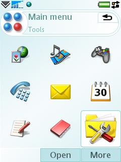
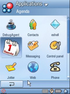
This difference is immediately apparent in the screen layout which, in contrast to the P990, provides for both one handed and two handed (pen) based usage. UIQ 3 provides for a lot of customisation of UI elements (such as layout and position of elements) and the implementations of the UI on different devices can vary considerably. This is most noticeable between the PenStyle P990 and the SoftkeyStyleTouch M600 and W950, but there are differences even between these two devices.
In practice, what this means for the M600i is that it is possible to use the phone in three distinct ways. Firstly as a one handed device using the hardware keys in conjunction with fingers on the touchscreen softkeys, secondly as a two handed device, using the stylus together with either handwriting recognition or the keyboard and thirdly a mixture of the first two options at different times.
The M600i does work as a one handed device, but the hardware design does let this down to a certain extent. Unusually for a device that is designed to be used one handed, the M600 has neither a direction pad nor physical keys for the on screen softkeys. The lack of physical softkeys is not an issue once the initial reluctance not to use fingers on the touchscreen has been overcome, but the lack of a direction pad does mean that navigating the UI can seem cumbersome. The scroll wheel, back key and arrow keys do the same job but their physical separation is inconvenient. There are some places in the UI, such as configuration dialogs, where arrow key behaviour can appear to be inconsistent because of different UI widgets, and the lack of a directional keypad is noticeable when moving through large blocks of text.
In two handed, or pen based usage, the M600 performs very well. While it lacks the immediate convenience of one handed usage, the touchscreen user experience is both extremely intuitive and quick to use.
In practice you will probably find yourself mixing the two styles depending on the situation. The pen-based approach makes more sense when working on documents or on a significant task whereas one-hand usage makes more sense for quick tasks such as answering the phone or sending a quick message. The inevitable result of this dual usage approach is that instead of optimising for one particular usage scenario both must be catered for and this does result in both software and hardware compromises. As a result, there can be something of a feeling in both hardware and software design of falling between two stools.
UIQ 3 is relatively unusual for smartphones in that it is not associated with a simpler or alternative UI. For example Windows Mobile has clear links to PC Windows, while S60 has usage patterns inherited from Series 40. This UI baggage has both advantages and disadvantages. The upgrade path to UIQ 3 is not clear, nor is there is a familiar ‘PC like feel' to make new users comfortable. Instead there is a learning curve which may initially discourage new users. Switching UI or platforms is not always an easy thing to do as existing usage patterns must be forgotten and new ones have to be learnt.
However UIQ deserves a lot of credit for creating a mobile task-orientated intuitive user experience that is reasonably easy to pick up. More crucially there are also a multitude of powerful extra features and shortcuts lurking beneath the surface, which become apparent with increasing familiarity.
The new UI is not perfect - there are occasional inconsistencies, but UIQ 3 is more approachable for novices than many other mobile platform user interfaces. Users who are more familiar with existing platforms may not be as happy as they will find that UIQ 3 does not always do things in the same way as their existing device.
UI Reality
In looks UIQ 3 is reminiscent of UIQ 2, but there have been major changes. The softkey bar (with up to three items) and the status bar are shown at all times with the middle four fifths of the screen changing depending on the circumstances.
The softkey bar is the key to navigating the device. It can have between one and three buttons. The default action (pressing in the scroll wheel) is the central button, the right hand button is mainly used for the ‘More' action which brings up a menu containing further options. The left hand button is used for secondary actions or shortcuts. In addition to these softkeys there is generally either a back button or close (x) button on upper right part of the screen.
The ‘home' screen of the device is the activity screen which is similar to the today screen or Active Idle screen found on other devices. It has two major elements - an expandable list that summarises calendar entries, new messages, due tasks, missed calls, and currently-playing music - and a line of four icons to quickly launch applications. All of the elements are customisable in some form so it is possible to tailor the home screen of the device to personal preferences quite effectively. The activity screen can be accessed by pressing the back button repeatedly until the UI returns to the home screen, or by holding down the back button for a second or so. In real use it is never more than a second or so away.
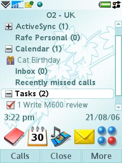
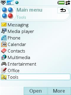
One of the shortcuts of the activity screen is the main menu icon which takes you to the main menu (application launcher) which can be shown as a list or a grid and will be familiar to anyone who has used a mobile UI. The combination of the activity screen and main menu screen works well.
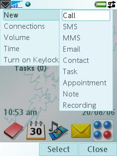
The status bar, positioned at the top of the screen, contains the usual indicators for new messages, battery strength, Bluetooth status, and many more, but it also has two additions - the status bar menu and a shortcut to Task manager.

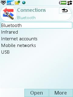
The status bar menu provides quick access to creating new tasks or actions (such as calls, messages, appointments, notes and contacts), to connections (Bluetooth, USB, IrDA), to volume control, and to keylock. Since the menu can be accessed at all times this provides for very quick access to common telephone-related tasks. Unfortunately this menu can only be accessed using the touchscreen which hampers its usefulness in one handed mode.
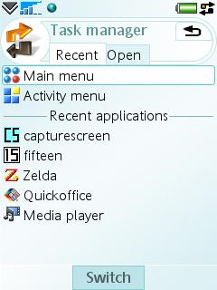
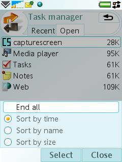
Task manager is much more than the name implies, but at a basic level it allows you to quickly switch between applications. Unlike UIQ 2, UIQ 3 doesn't tamper with an application's state when you switch away from it - this, together with Task manager, means the M600i is a true multi-tasking device. Task manager can be accessed from the shortcut on the status bar (again not easy in one handed mode) but it is also present in most application menus. It is also possible to set the hardware button on the right of the device to point to Task manager, which is something I would recommend. Task manager is made up of two tabs - recent and open - both of which list applications. The recent tab has a shortcut to the activity and main menu screens together with a list of recently used applications all of which can be switched to with a single key press. The open tab is a more traditional task manager - it lists the currently running applications and allows you to switch to them or to end them. The end result is an effective way to switch between applications in a way that is more flexible, intuitive and fast than a traditional application launcher.
Finally in UI usage terms it is worth examining the approach to links between applications. There is a strong emphasis on application chaining, which is the calling of one application from another to carry out a specific task path. For example in contacts it is possible to send a message from the contact record screen, this calls the messaging application, once the message has been sent the phone return to the contact record. For the users this means thinking less in application terms and more in task orientated terms. For a mobile device this approach makes a lot of sense (as on most other Symbian OS-based devices to varying degrees) and it is this strong application chaining that underlies much of the ease of use of UIQ.
Messaging and Office
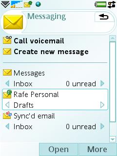
The M600i is first and foremost a messaging device and it is this element which must measure up in the first instance. Fortunately the M600 has an excellent unified messaging application. Voicemail is now integrated into the Messages application as a shortcut. New messages, regardless of type, are created from a single shortcut point which is quicker and more straight forward than creating messages from within the appropriate inbox.
SMS, MMS and beamed files are combined into a single Messages inbox. The M600i supports both POP and IMAP standards and allows for the use of IMAP Idle and scheduling of POP downloads to bring quasi push email to standard email accounts. The comprehensive scheduling options and the ability to download just headers, emails below a certain size or a limited number of emails give great flexibility in email retrieval.
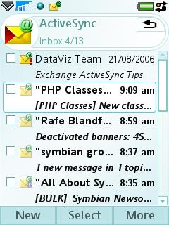
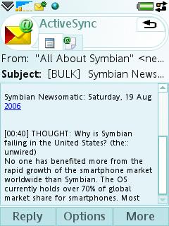
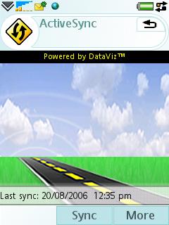
Push email is also supported, with all the major vendors promising M600i support. At the time of writing, both the Blackberry and Microsoft Exchange solutions were available. The Exchange solution is provided as a free download from the Sony Ericsson web site (the SIS file is also on the memory stick that ships with the device) and is a branded version of DataViz's RoadSync solution. The Exchange sync works as expected and allows for the synchronisation of email, contacts, calendar and tasks. Unfortunately there is no option to automatically switch off push or sync at weekends or in the evenings. As with other mobile solutions, email sync is limited to the basic inbox, sent and drafts folder.
It is also possible to set up a PC Sync email inbox which syncs emails from a PC email client such as Outlook.
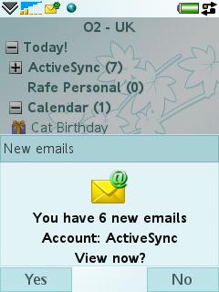
Each standard email, push email system or synced email box has its own Inbox and set of folders. As a result the M600i offers a flexible messaging device even for those with multiple email accounts. Each Inbox can optionally be shown on the activity screen giving an at-a-glance view of new messages. New messages are also heralded by a new message dialog which pops up on screen, optionally with an accompanying sound alert.
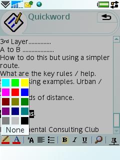
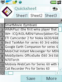
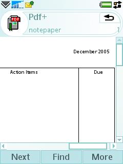
The M600i's attachment handling out of the box is impressive too, thanks to the inclusion of Pdf+ (mBrainSoftware) and Quickoffice, which between them should cover the majority of email attachments. Quickoffice is able to both view and edit Word, Excel and PowerPoint files. Quickoffice is an impressive achievement and is one of the best office suites available for mobile devices. The UIQ 3 version has received a number of upgrades in both the document round-tripping and functionality departments. The large majority of users will find that if they use Quickoffice to edit their documents on the road they will be returned to the office with full original formatting intact. New features include an impressive landscape mode which makes the most of the screen when editing larger spreadsheet files.
PIM Applications
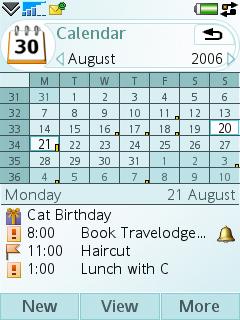
UIQ has always had strong PIM application and the M600i continues this tradition. The Calendar application makes good use of the available screen space. The touchscreen is well utilised too - it possibly to move events by dragging and dropping them to a new time. Folders (or categories) continued to be supported in UIQ 3 although rather than being part of the menu bar they are accessed via the More menu. Calendar is well specified and boasts an impressive list of features including recurring events, tentative events, meeting requests.
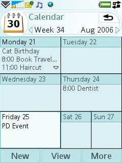
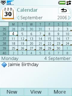
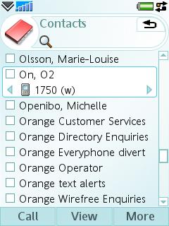
The Contacts application is similarly well laid out and the contact database allows comprehensive information to be stored for each contact. The search functionality is a little disappointing allowing only first name, last name, or company name to be searched at one time. This means you either have to switch the sorting to the appropriate type or remember the last name of your contacts when searching. On the plus side a long press of any of the keypad keys bring you to the Contacts application from the activity screen and there is good integration with the rest of the phone's applications.
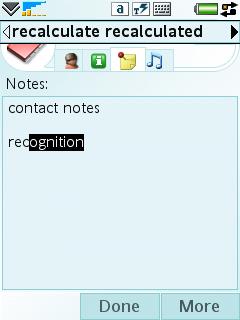
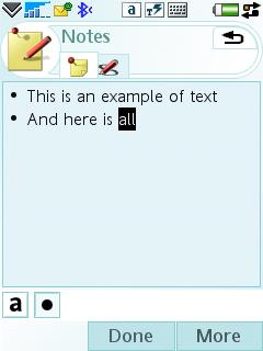
In addition to Contacts and Calendar there are basic Notes and Tasks applications. The Notes application supports both text and handwritten notes. A few additional applications are provided in the Tools Folder including Calculator, Converter, Time, Stop Watch and Timer applications.
Web
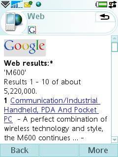
Access to the Web is courtesy of a branded version of the Opera browser. The browser supports a full range of web standards and is quick to render most pages. Pages can be viewed either in ‘full web' mode or can be viewed in ‘fit to screen' mode. The second of these can be hit and miss, but is generally much easier than scrolling around a page in full web mode. The browser can be used in portrait of landscape mode, with the second option generally giving a better user experience.
The browser lacks the wow factor of the Web browser on S60 3rd Edition phones (no page overview, no visual history), but is otherwise fully featured and Opera is the best of the more traditional mobile browsers.

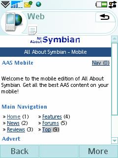
A basic RSS reader is included with the M600i. Features include the ability to schedule updates and there is good integration with the browser both for adding new feeds and opening feed items. However the lack of an import option means it is best used for mobile specific feeds or for a few of your favourite desktop feeds.
Multimedia and Entertainment
For a business focused device the M600i has impressive multimedia support. Music (MP3, AAC, AAC+), video (3GP, MP4) and web streams are supported via the Media player.
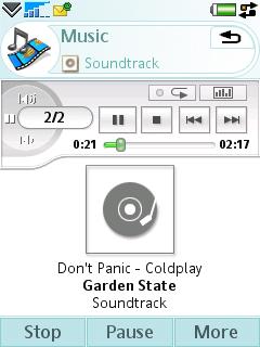
Video performance is good, with full screen landscape playback a single touch of the screen away. Getting video files into a compatible format may prove more troublesome for users as the M600i is quite picky about the MP4 codecs that it supports. The music player is particularly impressive with a well laid out application that includes a comprehensive set of features including playlist management (including editing), music library management, album art, equaliser presets and a mega bass feature. A nice touch is the ability to filter the music shown in the music library to exclude lower quality files or specific file types.
The quality of the stereo output is excellent through the supplied headphones, although a proprietary connector is used. The M600i supports the A2DP Bluetooth Profile for stereo music playback over Bluetooth and the music application includes a nifty feature allowing you to control where the audio is sent (headset, handset speaker etc).
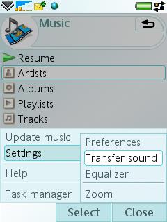
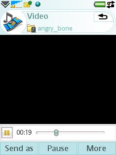
Other multimedia applications include Picture gallery for viewing and editing images, Play Now for accessing online downloads, Sound recorder and Music DJ for creating ringtones.
Picture gallery is an impressive application with comprehensive image management features and a useful folder slideshow feature. Integration with the rest of the phone is good - from Picture gallery you can add pictures to contacts, set images as wallpapers and send MMS messages. The editing features are good too, with photo correction, image cropping and the ability to add clip art, text and frames to images. However, because the M600i lacks a camera its potential use is relatively limited. MusicDJ is a curious inclusion in the software bundle - I wonder how much use it will get on a business focused device is open to debate.
Two games are included out of the box - QuadraPop - a derivative on the tile falling/moving game genre and the inevitable businessman-friendly Vijay Singh Golf game.
As a Phone
With everything else that is packed into the device, it is easy to forget the M600i is a phone too. Thanks to its slim proportions the M600 is comfortable in the hand and feels like a normal phone. However the screen does tend to get covered in finger and ear prints, requiring the occasional cleaning.
All the usual phone functions, such as speakerphone, hold, reject with SMS, calling cards, call log, speed dial, voice control, conference calling and more are present and easily accessible. Voice features remain a central part of the device and call quality and signal strength/connectivity are good.
The voice control (accessed by holding the jog dial in on the standby screen) does required the recording of voice tags, which seems out of date compared to speaker independent recognition systems found in competing devices.
The call log includes a number of useful functions including the ability to add notes to a call entry, remove or edit specific entries, make follow up calls or send follow up messages and view total call counters.
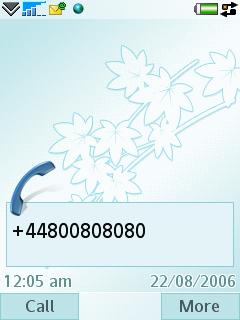
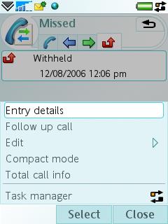
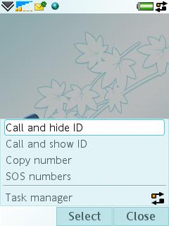
There are no profiles on the M600i, although there are offline (accessed via the power button) and silent (accessed via a long press on the # key) modes.
Connectivity
As a dual mode UTMS/tri-band GSM phone, the M600i has good connectivity for the European and Asian market. However, the absence of the 850 GSM band (USA usage) and EDGE (fast data on non-3G areas) is disappointing. The absence of WiFi is perhaps not surprising given the device dimensions, but it would have been a welcome extra.
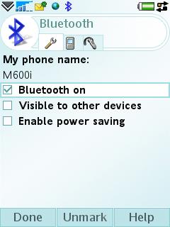
Local connectivity is very well catered for with USB, Bluetooth 2.0 and IrDA options. USB can be used in phone mode or file transfer mode. In file transfer mode the device's memory stick appears as a USB mass storage device when plugged into a PC. The USB cable doubles as a charging cable which is a welcome features for road warriors. The Bluetooth implementation is impressive with fast and stable transfers and support for multiple Bluetooth profiles including the more unusual HID and A2DP.
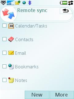
PC Suite has much functionality, stability and ease of use improved from earlier Sony Ericsson smartphones. The phone can be synced locally with Outlook, Lotus Notes, Lotus Organizer and the Windows Address Book (Outlook Express). Wizards walk you through the set up process and during the testing period there were no problems with the PC Suite Sync software. The phone also has a full SyncML client which can be used via a local connection or over the air.
Other features of PC Suite include a backup manager, file manager for viewing and transferring files to and from the phone, an application installer, a MMS message composer, and a mobile networking wizard. The mobile networking wizard lets you use the phone as a modem when tethered to a PC.
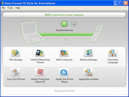
Sony Ericsson also supply the Disc2Phone software to assist with getting music from CD and the PC onto the device, Adobe Photoshop Album SE to manages images, and the free Quicktime for video playback.
Real world usage
On the whole the M600i is very responsive and a definite improvement over earlier UIQ phones which tended towards sluggishness. There are occasional slow pauses between actions, but these were generally not at critical junctures.
The M600i has a reasonably generous amount of RAM, but I did find that on some occasions (such as when opening large web pages with multiple applications running in the background) that applications would close in the background, indicating that memory was getting low. While this is not a major concern, it can be irritating when multi-tasking especially with the PIM applications. Thankfully, applications open quickly and the task manager allows fast access to recently open applications, which goes some way to dampening this issue.
Battery life is acceptable with the M600i managing a full day of heavy usage with continuous push email messaging functionality. With lighter usage the battery will stretch to several days, but is unlikely to approach the claimed 14 days of standby time.
As with other advanced smartphones, early adopters have reported that there are a few bugs. For example, attempting to create a new task from the activity screen throws an error. Fortunately the M600i has user upgradeable firmware and those with early firmware will certainly benefit from updating the software.
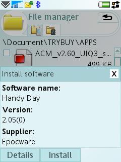
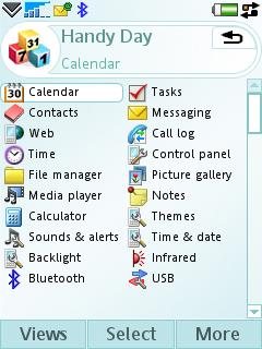
As mentioned earlier, the M600i is the first UIQ 3 phone on the market, and as a result the amount of third party software available is limited. This situation will improve over time, especially as additional UIQ devices become available, but may be a consideration for early adopters. Sony Ericsson have included a Try and Buy icon on the phone which is a shortcut to an on device web page which lists a number of third party applications which are stored on the memory stick. These include the Mobipocket Reader, the excellent Handy Safe and Handy Day from Epocware (although this bundle is better value), and various other applications and games. It is encouraging seeing Sony Ericsson make such a move as it introduces novice users to the idea of installable third party applications. Further applications can be obtained from the Sony Ericsson Application Shop (web based) which also enjoys a shortcut on the phone.
Conclusion
The M600i is an immensely powerful device loaded with functionality. If you are looking for a small sized messaging orientated phone then it has a lot to offer. While the absence of a camera and additional connectivity options may put some people off, the M600i meets its target audience head on. In contrast to earlier UIQ phone, this is not a ‘do everything' device, rather it is one that through a refined hardware design is targeted at a specific user niche. This niche targeting strategy has been very successful for Nokia's smartphone range and I expect Sony Ericsson to replicate this success.
Thanks to both the keyboard and the software, the M600i is a capable messaging device. In use it does not entirely measure up to a pure email device such as the Blackberry, but it offers a great deal more functionality in other areas. It is an excellent personal information manager, has strong multimedia credentials and good voice capabilities.
In the M600i, UIQ 3 gets its first outing and although there are a few inconsistencies there is, for those willing to spend some time on the learning curve, a first rate user experience.
The one handed usage is let down by poor key design and placement, but the pen based usage excels. Combining one handed usage and pen based input together means the M600i offers a great deal of flexibility which will make it attractive to a wide range of potential users - from ex-PDA types to feature phone upgraders.
Further Resources
All About Symbian UIQ 3 Software List
All About Symbian Sony Ericsson M600i Discussion Forum
UIQ 3 Interface Preview (P990 PenStyle)
Reviewed by Rafe Blandford at
