It's amazing how many parts of all kinds of UIs (including the Macintosh's current UI incidentally, for those Apple fans who wish to chime in at this point) have severe inconsistencies in the way they're used, and make unreasonable assumptions about how much the user is willing to read the manual.
The main problem seems to be that the designers don't want to break with how the previous UI worked for fear of upsetting existing users, so any complexity simply appears as bloat rather than forming an integrated part of a simple interface. It alienates people new to the UI.
"I pleaded with her that her smartphone could do everything the pink bit of plastic could do and 100 times more besides and that it was a LOT easier to use into the bargain. To no avail. The Barbie thing was pink. And looked cool."
Well, at that age I don't know if any piece of intricate technology is going to be that significant compared to the appearance of its casing, but even so I've seen exactly the same reaction in adults when they buy a phone in a shop.
A lot of people carry these attitudes with them all their life, which is why I pleaded with manufacturers to experiment a little with their smartphone casings:
http://www.allaboutsymbian.com/features/item/S60_Smartphone_Colours.php
Smartphone manufacturers are throwing away sales if they insist on taking a 100% technophile approach to aesthetics with no options for other people.
A LOT of people simply won't buy devices if they look dull or techie, no matter how useful they are or how easy or fun they are to use. It's the technological equivalent of trying to get people to use sensible shoes when they really want trainers. Colours have a lot of appeal. They're simple but powerful.
The Nintendo DS sales skyrocketed in Britain when the pink model came out, you could not get one anywhere and canny ebayers at the time made a very nice profit (and they can still get their money back if they care to sell a second hand Nintendogs pink DS bundle). It wasn't technically any different to the silver DS, but it looked so much more fun and less like a calculator.
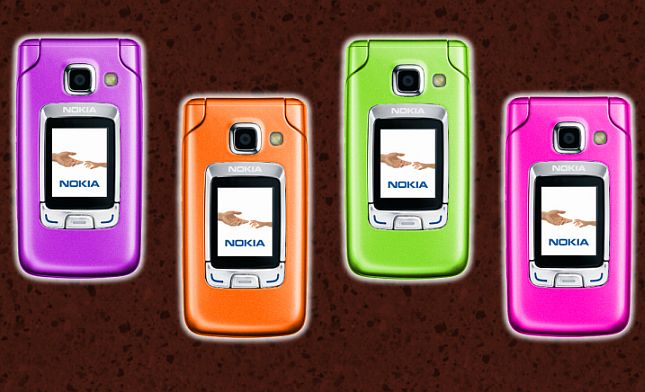
Which of the following would extend the appeal of smartphones, the official black and dark blue 6290, or the 6290 done up in the following colour schemes:
http://www.allaboutsymbian.com/images/features/article6290phoneslittle.jpg
?