Why on earth does the UI have to open a whole new text entry box along with the keyboard?
Don't worry, it doesn't open a new entry box if you don't want it to. 😊
Instead I'd like it more to function as other Touchscreen phones, where the keyboard appears (and occupies) the lower half of the screen, allowing you to switch through fields on the upper half without going back and forth between different screens.
You can already do all of that on the 5800 by using the mini-QWERTY keyboard. It does EXACTLY what you're asking for. 😊
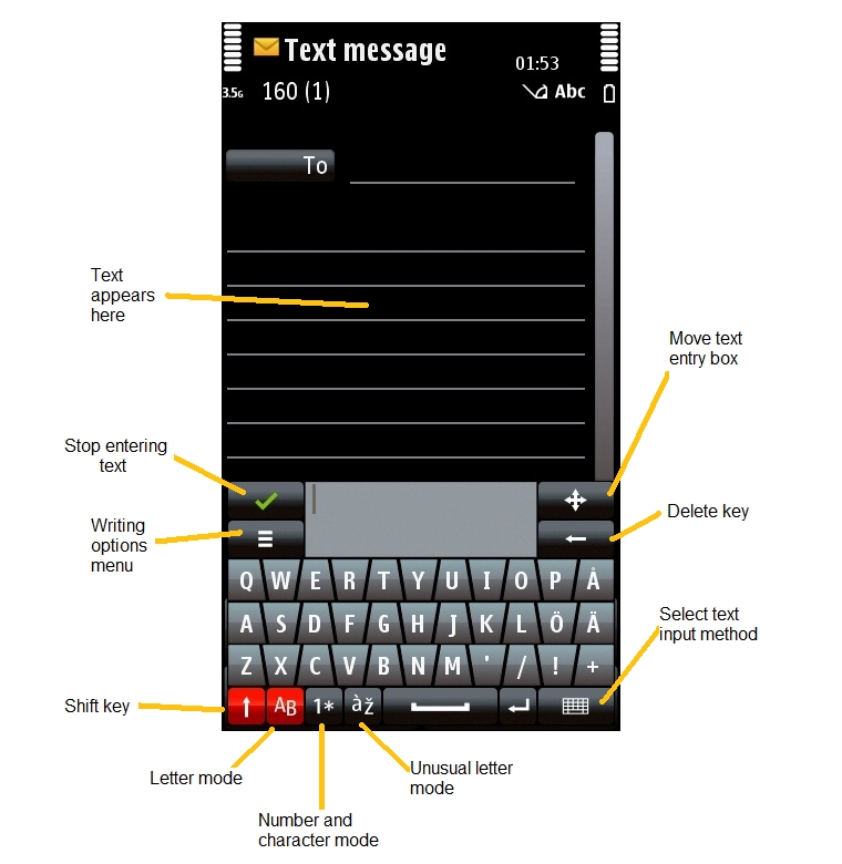
Mini-QWERTY just pops up a little keyboard in the bottom half of the screen which stays there until you tell it to go away, with your text appearing in the original text entry area. You can even move the mini-QWERTY keyboard around the screen if you need to select something near the bottom of the screen (such as the options menus). Mini-QWERTY works pretty much like a small second window floating on top of the first.
You can also change text entry fields completely freely while using mini-QWERTY, you don't have to close or open anything. On top of that, it automatically changes to numerical mode if you select a number field.
There is a small extra text box within the mini-QWERTY keyboard, but in effect you can totally ignore it and just use the main screen for selecting text and fields.
The mini-QWERTY keyboard's keys are pretty small and most people would require a stylus to use them of course, but that's why there are the full-screen QWERTY and full-screen keypad as finger-friendly alternatives.
Incidentally, the handwriting input mode also works just like mini-QWERTY but uses a different input method (gestures instead of clicks).
Here's an image from the text entry tutorial to show what I mean:
One of the reason I didn't change to 5800 is that I was confused by click and double-click in application navigator and in some applications, and unpredictable. Aren't you confused?
The very first day I had the phone I was a bit thrown, but as others have said it's really no different to single and double clicks on desktop PC interfaces.
If you click once on an icon in Windows it just selects it, whereas if you click once on a button in Windows it activates it. That might be confusing if you've never used a PC operating system before, but it soon makes sense after you've used it for a short while.
The reasons for this mixture are exactly the same on both S60 and PC interfaces, because they're both focus-driven, they want to give you the option of selecting an object without activating it.
For example on the 5800 if you want to select a photo and then delete it from the Gallery without having to open it first, you can just click on it once and then click on the delete icon. It saves a LOT of time overall to have the interface give you this option.
I do take your point though that the first time you use it, it does seem weird to see this kind of focus interface on a touchscreen phone. An alternative non-focus method of letting people select something without activation might be what Nokia have on their internet tablets, where a single click activates something but holding down your finger/stylus brings up an options menu for the object without activating it. That works fairly well on the tablets, and I'd be happy to see that used on S60 too.